There are fantastic logos that we will always be able to remember (even without the brand's sentimental attachment), while there are bland logos that we forget. The majority of us can agree on this.
![]()
This is where the hard logo style is functional. Every company should have this logo design, whether on the sides of a bus or in the form of little icons on our screens. They are used to distinguish a brand from its rivals and to convey the identity of the brand. A strong logo will not only be recognizable and appropriate for a variety of circumstances but will also truly express the business and its personality.
Without wasting any time, let's explore the hard logo style, its familiar characters, and examples in this article.
![]()
What Is Hard Logo Style?
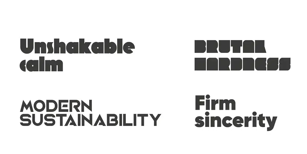
Hard logos serve as visual representations of the core values of a company. Therefore, it is essential to select your logo carefully since it will come to represent your brand. For example, a minimalist style might communicate elegance and refinement, while a more dynamic layout can express excitement or exploration.
A tagline, which often appears at the bottom of your logo, is a brief passage of text that serves as your company's philosophy or catchphrase. Successful taglines have three to seven distinctive words. This extra text on your hard logo, similar to a commercial jingle or well-known tune, aids in further connecting your design with your business.
Your physical brand identity should convey information about your services, aid in recall, and reflect your company.
What Makes A Good Hard-Style Logo?
Ensuring your hard logo stands out from the crowd requires careful consideration of colors, layout, fonts, and shapes.
Logo design
There are several types of hard-style logos. One of the secrets to making a fantastic tough logo is picking the right logo for your organization. There are different sorts of logos; what you select will rely on the feelings and message your logo should convey. For example, a typographic logo with simple geometric graphics can be more legible and emotionally engaging compared to a logo with a subject icon. Making this choice will have a significant impact on the final logo.
![]()
Colors
Ever wonder why certain businesses use specific colors for their hard style logo? Or why do certain companies choose particular hues in their branding? The science of using color to evoke sensations and emotions is known as color theory and psychology. A company can build the ideal challenging logo for their brand by understanding what hues cause distinct feelings in customers. For your hard-style logo, using the appropriate colors pays off in spades.
![]()
Patterns & Shapes
Shapes have the same emotional impact as colors. Therefore, making a beautiful, challenging logo requires knowledge of shape psychology. Here, we're not only referring to squares, circles, and rectangles but also to the intricate geometric designs that make up your brand. In contrast to gentler curves, ovals, and geometric shapes, which might suggest a sense of timelessness, mystery, or enchantment, sharp angles and straight lines are associated with discipline and power.
![]()
You can create the ideal hard-style logo for your company by striking the correct balance.
How To Make Hard Logos
Think about the nature of the font
Consider how heavy and powerful the fond should be, perhaps strict lines are enough, or maybe you want to see it as heavy as possible. Additional graphics can enhance the perception of brutality or reliability. A frame or background shape works great for this and keeps the focus on the title.
Utilize the area you have.
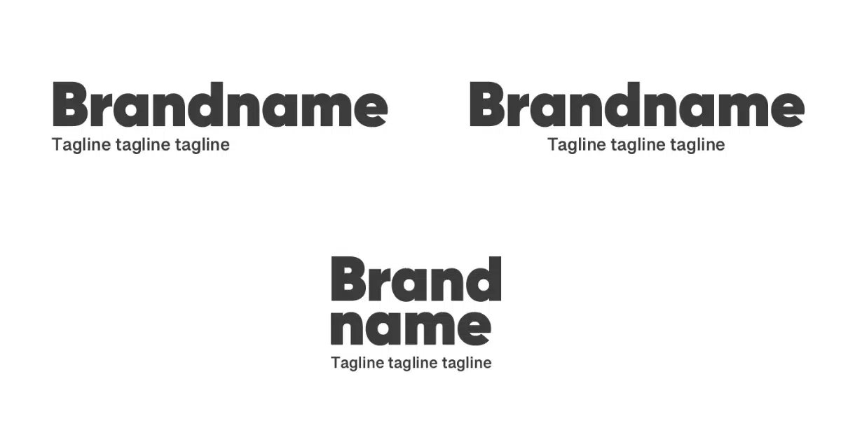
The font isn't sufficient for most businesses to adequately convey their brand image. Instead, you can add your name and slogan in various ways if you choose a logo builder. Taglines, sometimes called slogans, are powerful statements encapsulating a business's spirit and idea
![]()
Only some businesses have a tagline. It's ok, but that doesn't imply you should squander this priceless area. Instead, if your name permits it, divide it into two lines while maintaining the font and size the same on each line.
To make the most of the space, divide your name into two lines. Play with capital or lowercase letters. Sometimes minor touches may make a massive difference in a well-designed logo. Even something as easy as experimenting with a letter case has the potential to elevate your trademark to entirely new heights.
Typically, lowercase logos radiate a more accessible, informal atmosphere, whereas uppercase logos convey a powerful sense of authority. However, you can still use capital text while neutralizing the look with your color scheme. Everything depends on balance.
Make your tagline balanced.
Talking about your tagline now. Making your tagline smaller than your name is a straightforward tip to adhere to guarantee that your logo makes perfect sense. For this reason, we advise limiting your text to 20–30 characters. It's advisable to choose a more minor (or more straightforward) font for your tagline if you're using a bigger font for your name for the same reason.
Make your logo's slogan shorter than your name to balance it.
Verify readability
Your branding materials, such as the site header and business cards, will feature your logo. However, your content should always be visible, irrespective of where your logo is displayed. Check the finished product on multiple platforms and devices to verify this is the case. Take notice of the text size and font that you employ (desktop, smartphone, tablet, etc.).
A good logo should be legible on all platforms and in all conditions.
Make a scalable layout.
Here's a tip for creating a solid logo: make sure it can be scaled throughout. Your logo should always seem professional and instantly recognized, no matter how big or small. This refers to the text (as previously indicated) and other components.
![]()
Scaling down very elaborate or detailed logos might take a lot of work. While there is no "one size fits all" in logos, making sure that yours is a high-resolution vector that can be scaled to different sizes and file types will ensure that it looks excellent wherever it is used. You can learn more about logo sizes for other circumstances to better acquaint yourself. You can also look at actual logo samples that specialists internally created for real companies.
Smaller sizes may not be appropriate for logos with excessive intricacy.
Align every component.
We want to be varied, but the golden rule of design is still relevant in this logo design advice. Your elements (brand, tagline, and icon) must be well-balanced once they are all there. An essential aspect of logo psychology is focusing on alignments, balance, and white space.
![]()
Although there are no hard-and-fast rules, we advise aligning all of your pieces in one of the following three directions: left, center, or correct, to be safe. Remember that the content and style of your logo should match.
Align each part of the logo in the exact direction.
Know your rivals
Make careful research on rival companies' logos to determine which ones successfully target your target market and which ones fall short. You may not only obtain actionable insight by examining your competitors' logos, but you can also set yourself out from the competition.
Best hard logo examples
Finally, let's look at what a famous strong logo looks like.
IBM
![]()
The hard-style IBM logo is a condensed representation of the company's official logo, conveying its essence and aesthetics in a more rugged and edgy form. The well-known blue name with white stripes representing the letters "IBM" is presented here as a angular and contrasting graphic element. The lines and angles in the logo create a sense of strength, strictness, and directness, highlighting IBM's technical orientation and reliability. Overall, this stylized logo is a bold and modern interpretation of the traditional brand, giving it a unique hardcore look.
Subway
![]()
The Subway logo is a distinctive and recognizable symbol that represents the brand's identity. It features the word "Subway" written in bold. The font is sleek and streamlined, conveying a sense of modernity and efficiency. The green and yellow colours evokes freshness and health, aligning with Subway's focus on providing healthier food options. The rounded edges of the letters add a friendly and approachable touch to the logo. Overall, the Subway logo effectively captures the brand's essence of fresh, fast, and friendly dining experience.
The hard-style logo brings a unique hardcore edge to the familiar Subway emblem, infusing it with a modern and edgy vibe.
Gilette
![]()
The strong logo design of the Gillette logotype is a powerful representation of the brand's identity. The word "Gillette" is displayed in bold, capitalized letters with a confident and commanding presence. The font choice is robust and assertive, exuding a sense of strength and masculinity. The color scheme, often a combination of dark blues or blacks, adds to the logo's boldness and sophistication. The sleek and clean lines of the letterforms convey precision and excellence, reflecting Gillette's commitment to providing high-quality shaving products.
Overall, the strong logo design of the Gillette logotype captures the brand's reputation for innovation, reliability, and the pursuit of a superior shaving experience.
Mentos
![]()
The hard logo design of the Mentos logotype is a captivating representation of the brand's identity. The word "Mentos" is displayed in bold, vibrant letters that exude energy and excitement. The font choice is dynamic and playful, reflecting the brand's lighthearted and fun personality. The colors used, often a combination of bright and cheerful tones, add to the logo's vibrancy and appeal. The sleek and smooth lines of the letterforms convey a sense of freshness and modernity, aligning with Mentos' refreshing and innovative confectionery offerings.
Müller
![]()
The robust logo design of the Müller logotype exudes a captivating and commanding presence, embodying the brand's essence with utmost strength. The word "Muller" is elegantly crafted in bold, impactful letters that resonate with confidence and authority. The carefully chosen font exudes a sense of power and resilience, reflecting the brand's unwavering commitment to excellence. The color palette employed, often a combination of deep hues or striking contrasts, adds a touch of sophistication and intensity to the logo. The sleek lines and precise curves of the letterforms evoke a sense of precision and craftsmanship, symbolizing Muller's dedication to delivering superior products and services.
Conclusion
Making your brand's logo is a unique and enjoyable process that establishes the core of your company identification.
Consider your business's fundamental principles and how you want to represent them as you generate ideas for your hard-style logo design. After all, this is how people will remember your brand.
Try to create many variations of your brand's logo depending on these logo kinds. Then, present them to a few individuals and gauge their reactions. You should put your skills to the test in this manner. We hope this article on the seven distinct kinds of the logo design was helpful and provided you with some suggestions on which type of design would work best for your company.
And keep in mind that with design, everything is in detail.