When it comes to designing a logo, choosing the perfect typeface is akin to choosing the right paint color for your home. You want it to be perfect because that new coat will revitalize your home and reveal a lot about the people who live there to your visitors.
Fonts are also employed to evoke specific responses and create unique mental associations with a brand, just like colors are for a house. Each font has its own set of advantages and psychological significance.
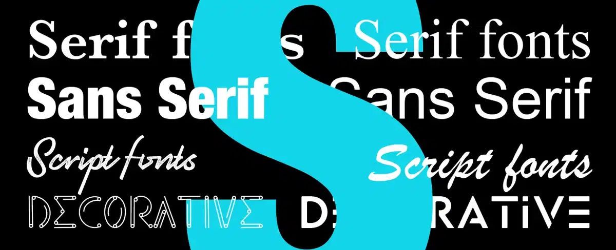
There are many various sorts of typefaces that we might employ in our logo design process, but they all come in one of four main types.
Let's check out these main types of fonts used in logos:
1. Serif fonts

This font is at the top of our list because it is the oldest form of font. Its start can be traced back to Roman sculptures. The little feet at the tops and bottoms of each letter are referred to assert. These tiny flourishes came from painters' brushes and were used as decorative accents on the letters.
Serif fonts are further divided into the following subcategories:
● old-style Serif fonts

● transitional Serif fonts
![]()
● modern or Didone Serif fonts

● slab serif Serif fonts

Those are simply different forms of serifs; some are large and bold, while others are more subdued. Serif typefaces are used in the logos of well-known firms such as Tiffany, Gucci, Burberry, The New York Times, and Rolex.
Brand examples:

If you want your business to be trustworthy, conventional, and even a little old school, this classic typography of font for logos is ideal.
2. Sans Serif Fonts

As minimalism gained popularity, demand for simpler, cleaner fonts arose. Sans serif fonts made their debut. These typefaces, as previously stated, lack serifs and appear to be more modern and streamlined. Sans serif fonts, like serif fonts, come in a variety of styles depending on the time period in which they were created and how they appear.
They were initially seen in the early 1800s. Initially frowned upon, sans-serif typefaces are now far more widely used than serif fonts. Their sleek style blends seamlessly with modern web design, and their lack of serifs allows for cleaner-looking text and improved reading in web publications.
There are four different styles of sans serif fonts:
● Grotesque sans serifs fonts

● Neo-grotesque sans serif fonts

● Geometric sans serifs fonts

● Humanist sans serif fonts

Sans serifs were created at the same time as serif platforms, but they are currently primarily employed in the digital age. This is where modern typography comes into play; we've seen a lot of rebrandings that favor sans serif lettering. Helvetica is the most widely used sans serif font, and many companies, including Jeep, Panasonic, Target, Microsoft, Caterpillar, and others, utilize some form of it in their logos.
Brand examples
![]()
3. Script Fonts

Script typography is a great method to give your logo an authentic and unique vibe by simulating cursive handwriting. These fonts are designed to look the same as handwriting, as their name suggests.

Because of their decorative nature, they are only used sparingly in web design. They're not going to be used for body text. They are most commonly used in very short phrases, such as titles.

Apart from the fact that they seem incredibly exquisite, they don't have anything in common. Brushstrokes, thicknesses, and the manner in which the letters are drawn differ from font to font. They can be found on restaurant logos, exquisite liquor bottles, beauty brand logos and packages, posters, and so on.
Brand examples

You'd see shop windows packed with these hand-written script letterforms done by humans called sign painters before computers. They would paint by hand with their brush, which is a great way to incorporate a human element into the design.
4. Decorative Fonts

The last type of logo font on our list is this one. There are no decided limits to what you may do when designing a new logo, and the decorative typography style is where you'll find some unconventional ideas. This is a good way to promote a modern firm with a distinct message or quality. Artists and musicians may opt for decorative styles, which give the font a distinct personality. The Vaio logo, which represents a Sony laptop sub-brand, is an excellent example of decorative typography.


There is a basic flowing pattern that clearly takes us into the future and provides us with something unique, while also providing style and sophistication. As artists try to create something new, this form of simplicity is frequently found in modern art and design. However, the logo design for the rock band Metallica can be found under this broad category. The rough jagged edges of the first and last letters convey the grit and intensity that the band is attempting to convey, and leave us with an entirely different impression than the previous example.
Brand examples

Conclusion:
Choosing the font for your logo is the most important part of branding. The correct one can help you better convey your company's values and aims by adding additional levels of symbolism to your brand.
Make sure to think about how each type and font style fits in with your overall brand image. Your brand may tell your company's story the way it was meant to be conveyed by choosing the proper mix of fonts and design components.