A logo is similar to a company's first impression of a company or you can say a front entrance. A logo is all about making a good first impression. It's a friendly welcome. It has a certain vigor about it. This is something that the world's most famous and recognizable logos have mastered.
What makes a logo design successful? Successful logos are instantly identifiable, convey a brand's message, and stand out among competitors. For this, a text logo is the best. Effective logos can be used in any size and location. Text logos are straightforward and easily comprehended by the majority of clients. They don't include any hidden messages and instead contain the company's name rather than a symbol.
All of this and more are accomplished by these logo redesigns listed below. Your logo will need to be redesigned every now and then. Sometimes, major changes in your brand's culture or direction necessitate radical new logo designs. By switching to text logos following companies are able to achieve huge milestones.
Let's take a look at a few organizations that have pushed the envelope with their logo redesign, why they've been so successful, and what we can learn from their iconic logo redesigns.
Benefits of switching to Text Logos
- One of the most significant advantages of text-based logos is that they instantly identify your company.
- If you see some well-known symbols, you'll be able to recognize them right away.
- There is no mistake in the thoughts of customers because text logos include the organization's name. The message is clearly transmitted, and people are not required to think too much when looking at the emblem.
- Text-based logos are easily recalled when compared to other types of logos. If you view a picture that doesn't contain a clear message, it won't stay in your mind for long.
- Although descriptive logos differ from text-based logos, text-based logos also provide some information. They include only a few details regarding the nature of the business or the organization's name.
- Text logos are straightforward and easily comprehended by the majority of clients. They don't include any hidden messages and instead contain the company's name rather than a symbol.
9 Most Powerful Logo Redesigns You must know:
1. Netflix
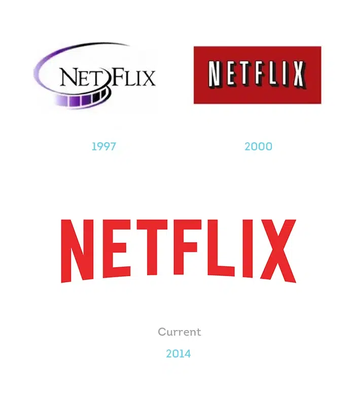
Do you recall when Netflix was primarily a mail subscription service? Now that Netflix is the reigning king of streaming media technology and original content, those seem like such distant memories. As a result, a logo refresh was long needed to reflect the company's new high-tech focus.
When placed over Netflix's trademark red envelopes, the old drop shadow design created the impression of movie theaters and was supposed to spring out at the audience. The new logo flattens everything down and emphasizes the red color branding, giving the company's identity a fresh lease on life. This graphics-to-text logo transformation had created a huge hype.
2. GoDaddy
Let's start with a contentious makeover that caused a split among the jury.
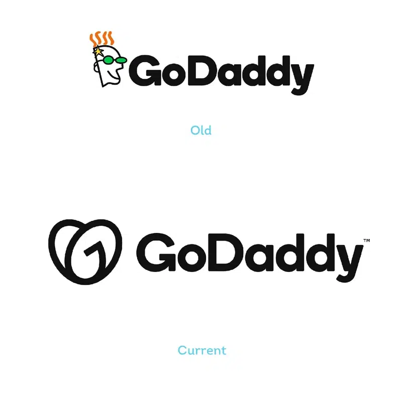
GoDaddy dropped their daddy mascot in 2018 and replaced it with a simple wordmark type logo in a single color. And in 2020, they quickly reversed their decision, reinstalling an emblem in the current way of the heart.
Some think the new Airbnb logo is upside down, but closer inspection reveals that it is obviously a "Go," presumably to create a spirit of entrepreneurialism.
The ailing GoDaddy brand gets a new lease on life with this new logo. The redesigned wordmark is a heart made out of the letters G and O. This creates a perfect impression of a warm and friendly brand. Furthermore, the new color palette is more appropriate for a contemporary setting.
3. Planters
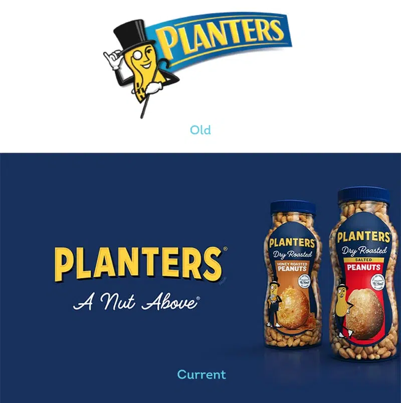
The Planters logo update is an excellent example of how to expand on existing aspects of a well-known design. The new Planters logo is robust, lively, and confident without sacrificing the essence of the old. The addition of a solid line at the top of the font adds weight, and the darker blue from the 2019 logo goes well with this option.
They perfectly separated the logo, the font part is readable and fits perfectly into the packaging design, while the character is used separately to decorate the food zone.
4. Burberry
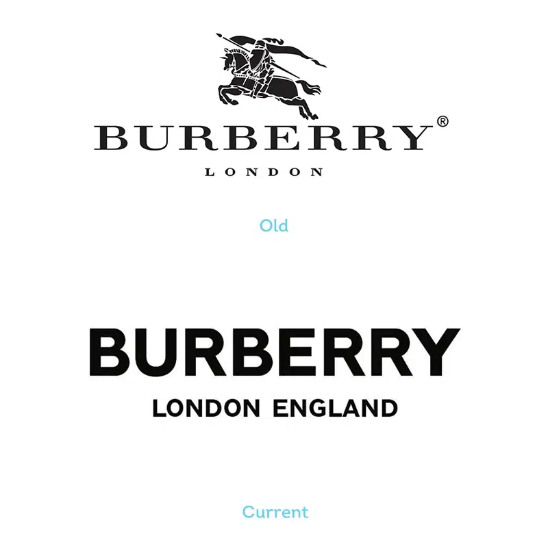
Burberry's visual identity has been represented by an equestrian and his charging horse for over a century. Burberry's trademark logo hasn't altered much over the years, but the brand made a major modification in 2018, removing the equestrian from the renowned insignia.
Burberry underwent a rebranding last year after designer Riccardo Tisci came over as creative director. He debuted a new digital-friendly logo (special to Quartz members) as well as a bright new monogram bearing founder Thomas Burberry's initials.
The end result is a powerful logo with increased momentum and an immediate presence that can adapt to a variety of situations.
5. National Gallery of Art
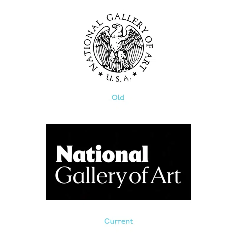
'Of the country.' For the sake of the people.' This is the driving phrase for one of America's most prominent galleries' logo revamp. The National has adopted a simpler, more direct identity that emphasizes diversity, brightness, and expression with the help of design agency Pentagram.
6. Popeyes
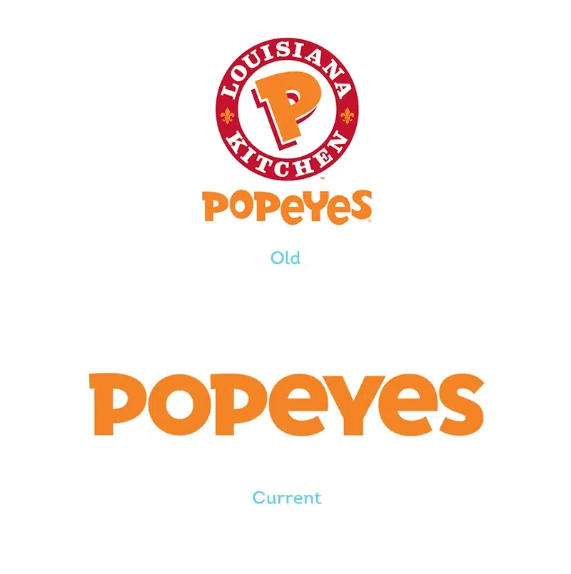
Popeyes Louisiana Kitchen has revealed a new logo, aiming for worldwide dominance or expansion. In any case, their new logo is clean and stunning, with a basic two-dimensional approach, a streamlined contemporary typeface, and a single powerful color that pops.
It's a vibrant update that manages to keep the essence of the original logo while introducing a contemporary vibe.
7. Papa Johns
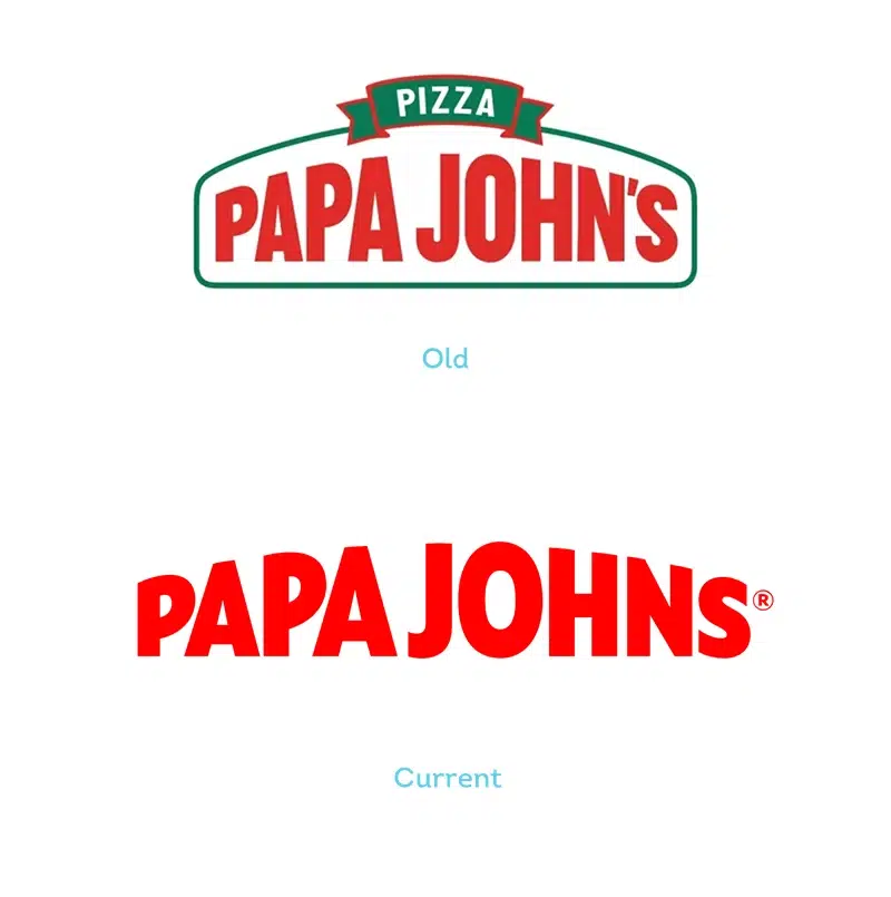
Pizza business Papa Johns is revamping its image after a tough couple of years in terms of public relations. We enjoy the new logo, despite the fact that not everyone does. Even if it is grammatically incorrect, removing the apostrophe helps the corporation distinguish itself from its former CEO. The brighter sans serif and the removal of the previous border and caption make this a more modern logo all-around.
8. Udemy
Udemy describes their new logo as "a logo that points us north" when discussing their revamp. Knowledge is uplifting, whether you seek it or share it. With an arrow – a common sign for expansion — our logo represents that upward movement.' We couldn't have phrased it any better!

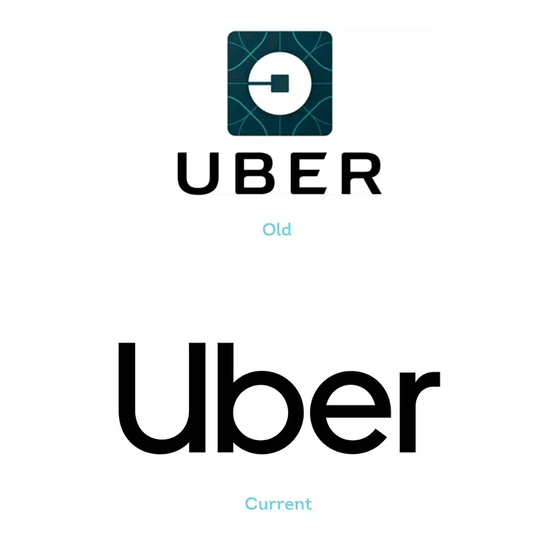
9. Uber
Uber's mobile app has also been revamped, and the company's goal statement has been altered from "Make transportation as reliable as running water, everywhere, for everyone" to "We ignite opportunity by moving the globe."
This is a look at the Uber logo as well as the company's history. Uber's logo and brand have grown to be a major player in the transportation and technology industries.
A logo that's as fresh as the service it's associated with. Uber's new brand identity perfectly reflects the company's focus on safe rides.
Final thoughts – Do you need a new logo?
There are numerous reasons why companies alter their logos. For some, the company's focus has shifted, and they require a new design to match. Others are adapting their brand identity to meet the times because the environment has changed.
It's beneficial to look at recent logo redesigns for whatever reason. You'll be able to examine how logos alter depending on their context, as well as the kind of design trends that are prevalent in general.
- Previous ArticleBenefits of Using a Type Logo
- Next ArticleLogo style – Modern