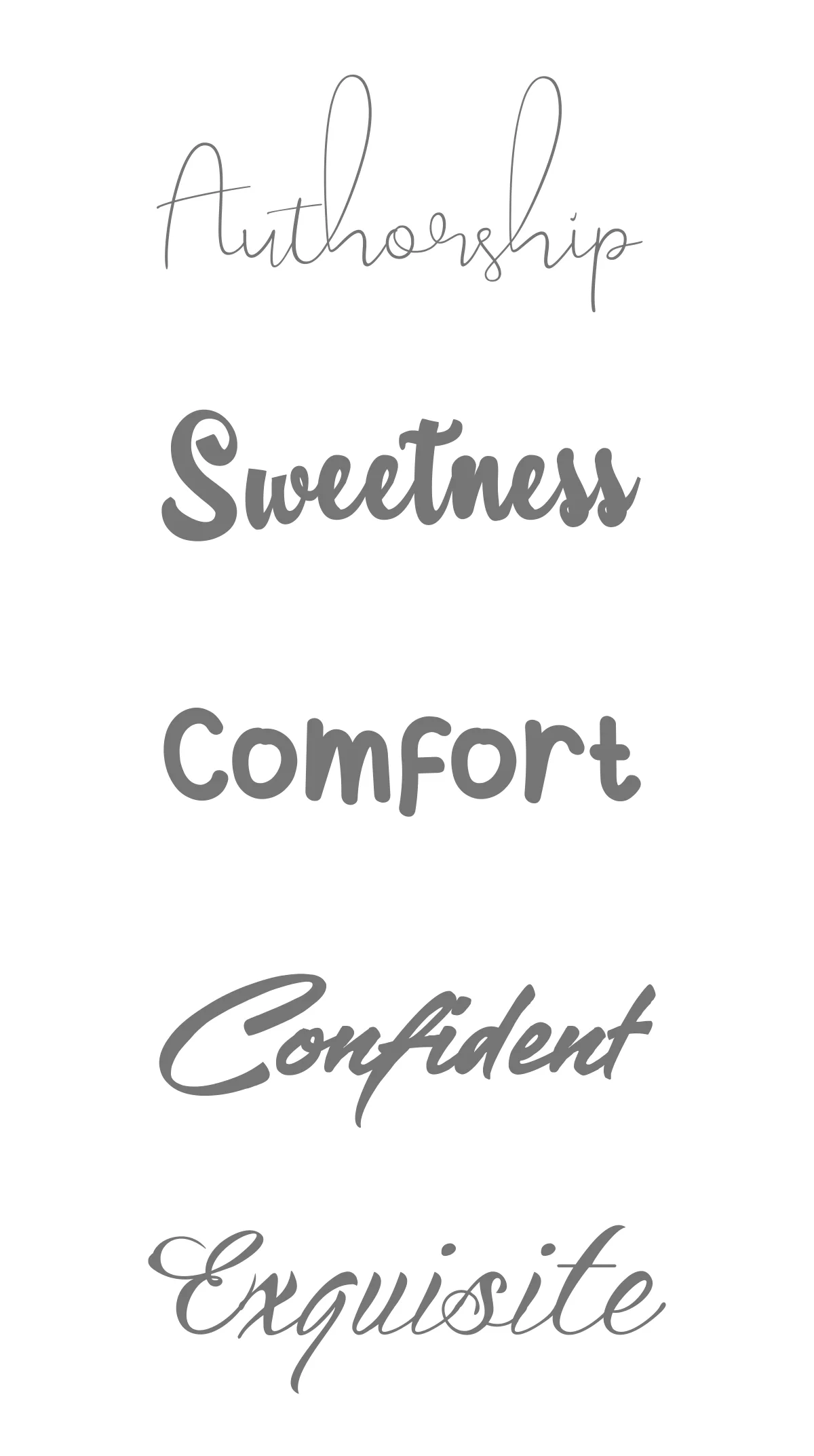
Kindness is like sugar; it enhances the sweetness of life! We have always considered sweet food as our idol. You might say that everything complements everyone's tastes because the shape appears enjoyable, and the flavor is also quite enjoyable. Finding people who had never tasted sweetness would be odd.
Ever noticed a well-known brand without a logo? No? That is the result of their absence. How your clients perceive your logo greatly influences your brand. So it only makes sense that you'd want your logo to stand out. How do you get there, though?
![]()
This helpful guide will give you all the knowledge you need to create the ideal logo for your brand. Read on to find out how to design a logo, from defining your brand's identity to knowing what makes a great logo to choosing the best design decisions and navigating the design process. As a result, here are a few easy-to-follow tips that will inspire you to develop a fantastic sweet logo. We will also feature the top-rated sweet logo brands.
What You Should Know Before Designing a Sweet Logo
Since it serves as the majority of potential consumers' initial point of contact, a logo is an essential component of every company's branding. Because of this, it's crucial to ensure that your logo accurately represents your business and has the power to appeal to customers. Several factors affect logo design, and they may change based on your requirements and the sector you work in.
With little space available, simple logos emphasize the core characteristics of a brand's personality. This entails paying closer attention to details like colors and fonts as well as simplifying complex concepts. Letter & word marks are other excellent options for a straightforward logo because they do away with graphics in favor of simply communicating business personality through fonts and colors.
A logo should establish a connection with customers and spark interest in your brand. Customers are more likely to associate your logo and brand with your business if they can quickly recall it. Easy-to-remember sweet logos that make a big impression are valuable because they help people remember your brand.
![]()
A basic style and minimal clutter will immediately increase the adaptability of your logo on a design level. Too many flourishes, lines, components, or colors can result in a complex design that won't scale well. Instead, be mindful of your restricted space and concentrate on saying more with less.
Best Practices For Sweet Logo Design
When you concentrate on the elements that give them their effectiveness, creating good logos is simple. You can create a solid foundation upon which to grow your brand by attempting to create a timeless yet adaptable design.
Making it straightforward will also make it easier for the audience to remember, increasing the relevance of your design. With a strong logo in place, you can begin building a memorable brand that will grab customers' attention and stick in their minds for a very long time.
![]()
As a result, we have created some best practices to help you identify the fonts, colors, symbols, and layouts that customers find appealing. Look over these useful tips, then incorporate them into your adorable logo design for sweet.
1. Consider A Proper Colour
The meanings of colors can vary greatly. Despite the complexity of color psychology, it may be summed up by saying that each color evokes a particular feeling or notion. Sweets are noted for having a flavor that is incredibly jovial and ideal for all palates. Even when a person is bored, they don't want something heavy, hot, or similar.
![]()
If the industry operates in the sweet industry, then that must also be harmonized. Have you ever seen a logo for a sweet that was both firms, assertive, and assertive while still having a highly delicious, energizing, and good-for-everyone-to-eat flavor? That's what your logo needs to reflect, too. Put on the proper colors.
![]()
Customers tend to favor the color that is most frequently used as the primary color in logo designs. For instance, blue for more gummy candies, green for mint candies, and of course, yellow, pink, and light blue for sweet candies.
![]()
2. Select An Appropriate Font
The typography and font you use to write your brand or brand on the package will also be of utmost importance. Today, consumers have little chance to choose without using the appropriate color scheme and poor typography. Selecting the proper font might be difficult, so before making your final decision, you should be familiar with the fundamentals. Try it right away by gathering all of the candy packages you've ever purchased and evaluating their font choices.
If you don't like it, get rid of it right away and go with the option you think is cool. To avoid being accused of plagiarism, do not, however, immediately follow the typeface in your lovely logo design. Simply select a comparable one. Change the distance between lines and letters as well. The typography and typeface section of the sweet vector is still present.
3. Examine The Competition
The ideal location to borrow and steal ideas? Your adversary! Look at what is presently available, what appeals to your target, and what you should steer clear of. While eavesdropping on those rival companies, consider how they differ from you and how you might highlight these differences in your logo design.
![]()
Make sure to distinctly differentiate yourself from your rivals. If every other company in your sector is going monochromatic, you might want to choose some color to stand apart. If everyone else has a classic logo, perhaps a quirky and contemporary one will stand out.
4. Logo Coordination With Brand Value
Making a logo for your candy shop (not necessarily the sweets sector, but also other areas that want to reflect the feeling of “sweetness” in the logo, it could be a bar, a children’s center, or even a family construction company) can merely be intended to serve as a banner or packaging. But as time goes on and the company expands, you should truly look at its fresh new face. Another thing the design community should be aware of is that one logo will be used more frequently. Starting with the exterior of your company and evolving into design themes for websites, brochures,& more general business marketing requirements.
![]()
So that fewer people will switch from one marketing location to another in the future, practically, all your business needs to do is alter the size and location. The rest is just an extra element whose nature is predetermined.
5. Started With Simple Shapes
You have the creative freedom to incorporate various shapes into your logo, depending on your brand positioning. Even intricate forms are an option, but it's crucial to consider where the logo will be displayed and its readability.
![]()
Simplicity often proves more versatile, embracing straightforward shapes and legible fonts, possibly even a handwritten style. Think ovals, circles, rectangles, frames, or even amorphous symbols. In most cases, the simpler the shape, the more easily it resonates with your target audience. The key is to strike a balance between simplicity and uniqueness, ensuring your logo isn't dull but possesses that distinctive flair!
Best Sweet Logo Brands
1. Mondelez International
Currently, Mondelez, an American global corporation, owns some of the most well-known sweet brands in the world, including Oreo, Milka, Toblerone, TUC, & Cadbury. The wordmark for Mondelez International is divided into two layers, with "Mondelez" appearing first in larger letters & "international" appearing below it in smaller letters.
![]()
The letter lines' curving pointy extremities give the inscription's smooth sans-serif typeface a lively, modern look. The font is comparable to Denis Serebryakov's Appetite typeface. Rich purple was used to create the wordmark, representing strength, luxury, and inventiveness. The logo's color scheme, which has two red graphic elements, reflects the steadiness and vigor of the enormous and powerful organization.
2. Mars Inc
Mars, another American business, has grown significantly. Some of the most well-known sweets in the world, such M&Ms, Galaxy, Snickers, and Skittles, as well as, of course, Mars bars, are produced there.
![]()
The Mars nameplate is positioned above a horizontally positioned, somewhat stretched black oval, giving the impression of a cosmic plane and incorporating the planet's name into the brand name. Built on assured lines and vibrant color combinations, it has a powerful and straightforward aesthetic identity.
3. Nestlé
Kit Kat, Nesquick, Nespresso, and Maggi are just a few of the well-known foods and beverages produced by Nestlé, a Swiss firm. According to revenue, it is the biggest food corporation in the world.
![]()
Its depiction of a bird on a nest alludes to the family name, which in German means "nest." Henri Nestlé created the new business logo with inspiration from his coat of arms. Three newly born chicks are being fed by their mother when he adds them to the nest.
4. Ferrero Group
With approximately $10.6 billion in yearly sales and an Italian founding, Ferrero is the third-largest candy manufacturer worldwide. The company created the hazelnut cream in Ferrero's renowned Ferrero Rocher. Among its other well-known candy brands are Kinder and Nutella.
![]()
The logo was an extremely classy symbol framed in an elaborate oval. The text inside the frame was done in two different ways: the top line with "Rocher" was done in delicate cursive, accentuated by a vignette, while the bottom line with "Ferrero" was done in extra-bold capitals of an elegant serif font.
5. Meiji Co
Meiji, a Japanese confectioner best known for creating Hello Panda & Yan Yan, also produces pharmaceuticals in addition to confections. A high rating for the business has been made possible by its additional sources of income in both meals and medications. Red is a warm, lively hue that is frequently linked to powerful feelings like passion, love, and rage. It is frequently linked to strength, power, and resolve.
![]()
6. Haribo
A German confectionery company called Haribo specializes in jelly sweets and is known for its recognizable shapes. It has production facilities in the UK and, shortly, Brazil. It is sold all over the world and is currently expanding into Asia. The corporation has its strongest footprint in Europe, and Britain continues to be a popular market.
![]()
The Haribo logo consists of a white background with a three-dimensional wordmark that mimics the lettering curve. The inscription's capital letters are all written in a bold, rounded typeface resembling Helvetica. VAG Rounded and Rounded Bold Condensed
7. Ezaki Glico
One of Asia's biggest producers of sugary snacks and confections is Ezaki Glico. Chocolate bars, wafers and crackers, truffles, pralines & filled chocolates, molded chocolate figures and forms, pans confections, toffee & caramel, nuts/seed candies, bars, bark, brittles and marzipan, and hard candies are some of its distinctive items. The only elements of this logo graphic are text or basic geometric forms. This does not meet the level of originality required for copyright protection.
![]()
8. Lindt & Sprungli AG
One of the most well-known manufacturers of chocolates and truffles in the world, Lindt has its headquarters in Kilchberg, Switzerland. Nearly $4 billion in sales are made each year. With a sans-serif inscription below, the script has changed from a serif typeface to a cursive design.
![]()
With the characteristic curl in the "L" at the beginning of the word, the font of the Lindt logo is among its most eye-catching elements today. The firm claims that the italicized, flowing letters are intended to resemble the flow of liquid of melted chocolate. The colors of the Lindt logo haven't changed all that much over time. The brand's use of gold in its wordmark has always been an attempt to imply a feeling of richness, prestige, and excellence.
Bottom Line
Creating a sweet logo design will make your brand more noticeable. Additionally, that is what will influence how consumers see your brand and it works. With a well-designed logo, you can later identify a common logo with the personality of your brand.