Having a lengthy brand name or description can make creating an impactful logo more challenging. Long names are harder to fit legibly across mediums and may lack memorability.
But with smart design strategies, companies with verbose names can still develop strong brand identities. This guide will explore principles and techniques for designing logos when dealing with long brand names.
Try our Free AI name generator
Abbreviating the Name
One straightforward option is shortening a lengthy name to initials or an acronym.
For example:
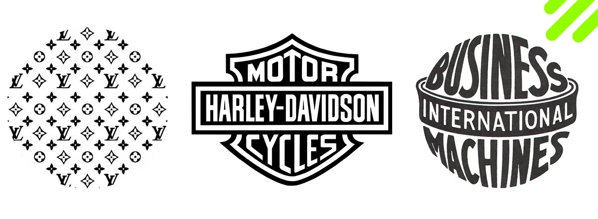
International Business Machines > IBM
British Broadcasting Corporation > BBC
World Wildlife Fund > WWF
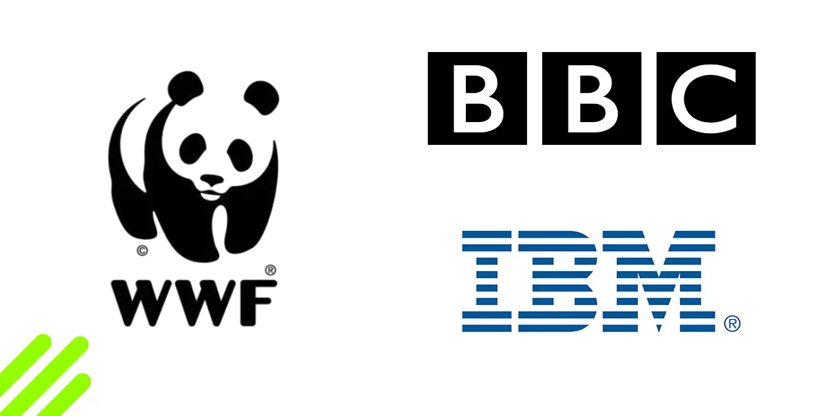
Before abbreviating, ensure the shortened form is unique and recognizable. Conduct trademark searches to avoid conflicts with existing brands.
Shortened initialisms create concise logos that efficiently reduce lengthy names to a digestible graphic lockup. This works best when the abbreviated name becomes well-known through consistent use.
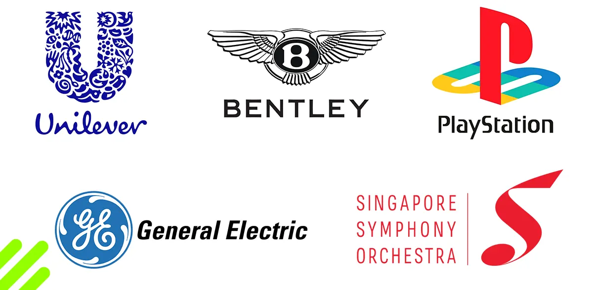
Truncating Words
If fully abbreviating loses too much context, a middle ground is truncating words down to 1-3 letters each.
For example:
Smithsonian Institution -> SmIn (for pronunciation) -> Smithsonian (in logo)
Administration for Children and Families -> AdChFa (for pronunciation) -> Children & Families (in logo)
California District Attorneys Association -> CalDAA (for pronunciation) -> CDAA (in logo)
American Civil Liberties Union -> AmCLU (for pronunciation) -> ACLU (in logo)
![]()
Truncation reduces length while retaining familiar word shapes. But it can compromise legibility if taken too far. Find the right balance between brevity and clarity.
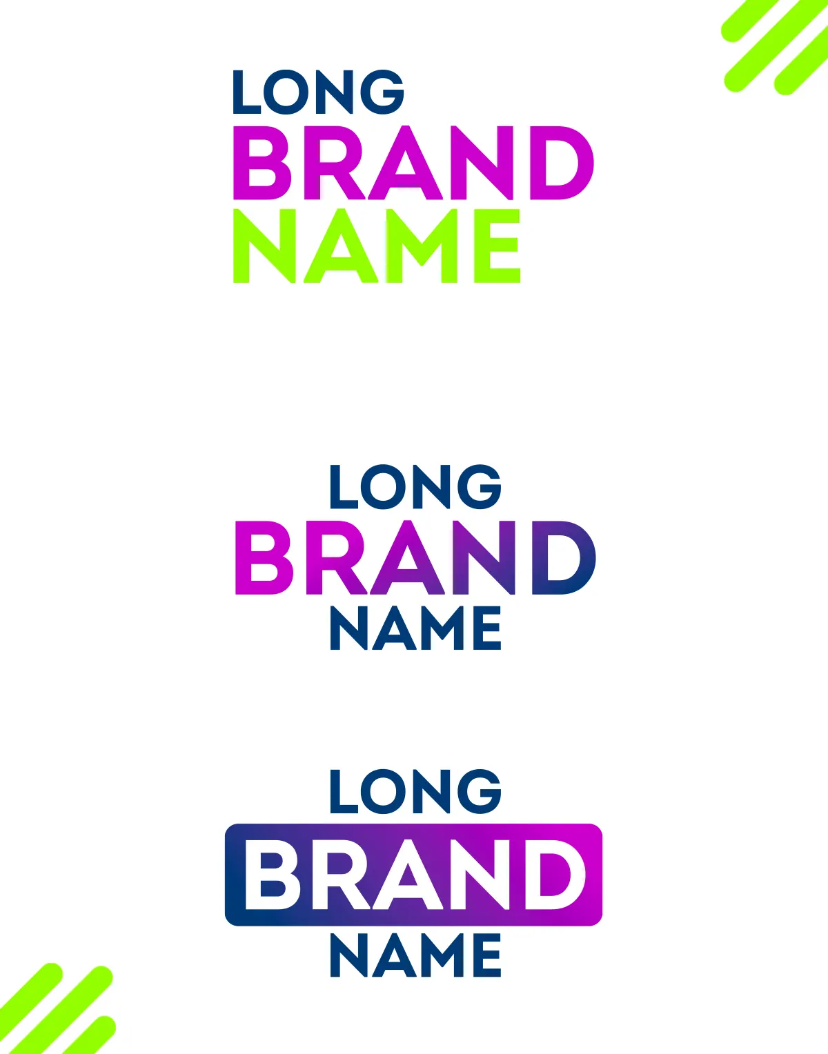
Condensing Typography
Rather than shortening the name, another option is compacting the full name into a condensed narrow logotype.
This approach utilizes:
![]()
Narrow font weights and tightly tracked letterspacing
Rotated vertical or diagonal text orientation
Small logomarks to free up space for type
Word shapes that efficiently fit together like tetris pieces
Ultra-condensed typography allows remarkably lengthy names to be comprehended intact at a glance. But legibility still needs caution at smaller sizes.
Hybrid Logos
A hybrid logo combines an abbreviated shortname with the full official name spelled out:
Shortname Logo + "Established [Full Company Name]"
[Initials] + [Full Descriptive Tagline]
For example:
WB + "Warner Brothers Television"
LVMH + "MOЁT HENNESSY LOUIS VUITTON"
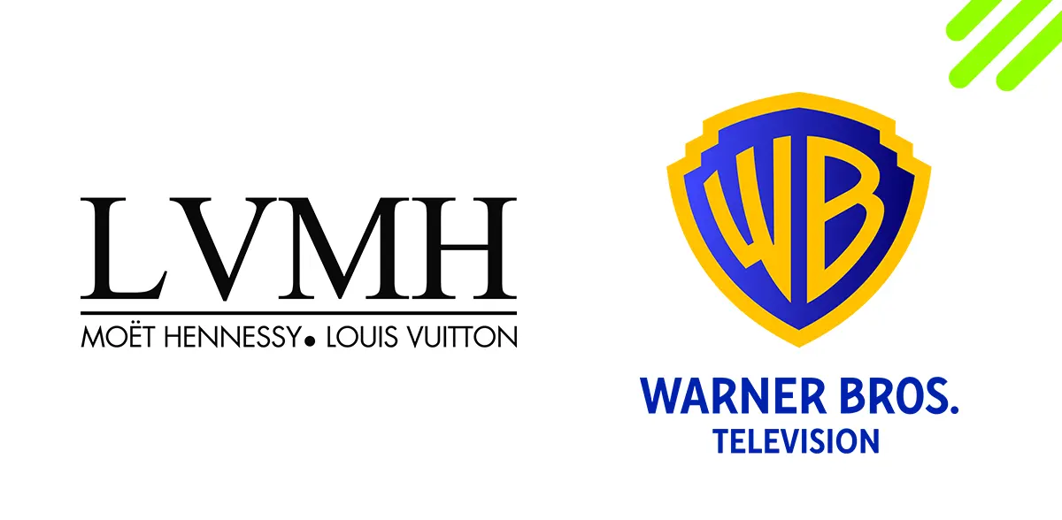
This provides the best of both worlds. The shortname creates a compact logo while the descriptive full name offers complete clarity.
Try our Free AI name generator
Icon + Logotype Lockups
Another hybrid approach is pairing an icon representing the brand with the full text name. The pictorial mark boosts memorability and recognition when the name itself is non-distinctive.
For example:
Icon of blimp = Full name "Goodyear Tire and Rubber Company"
Swoosh symbol = "Nike International Limited"
Bitten apple = "Apple Incorporated"
VW in Circle = "Volkswagen Aktiengesellschaft"
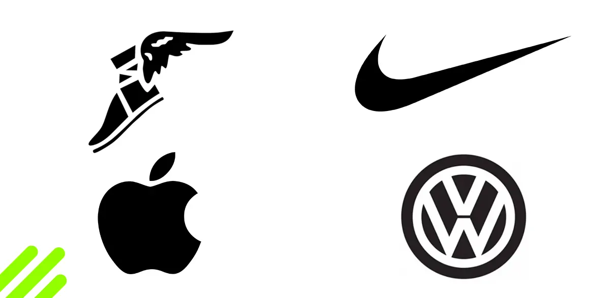
This allows lengthy names to become legible logos. The icon carries the visual impact when the full name is a mouthful.
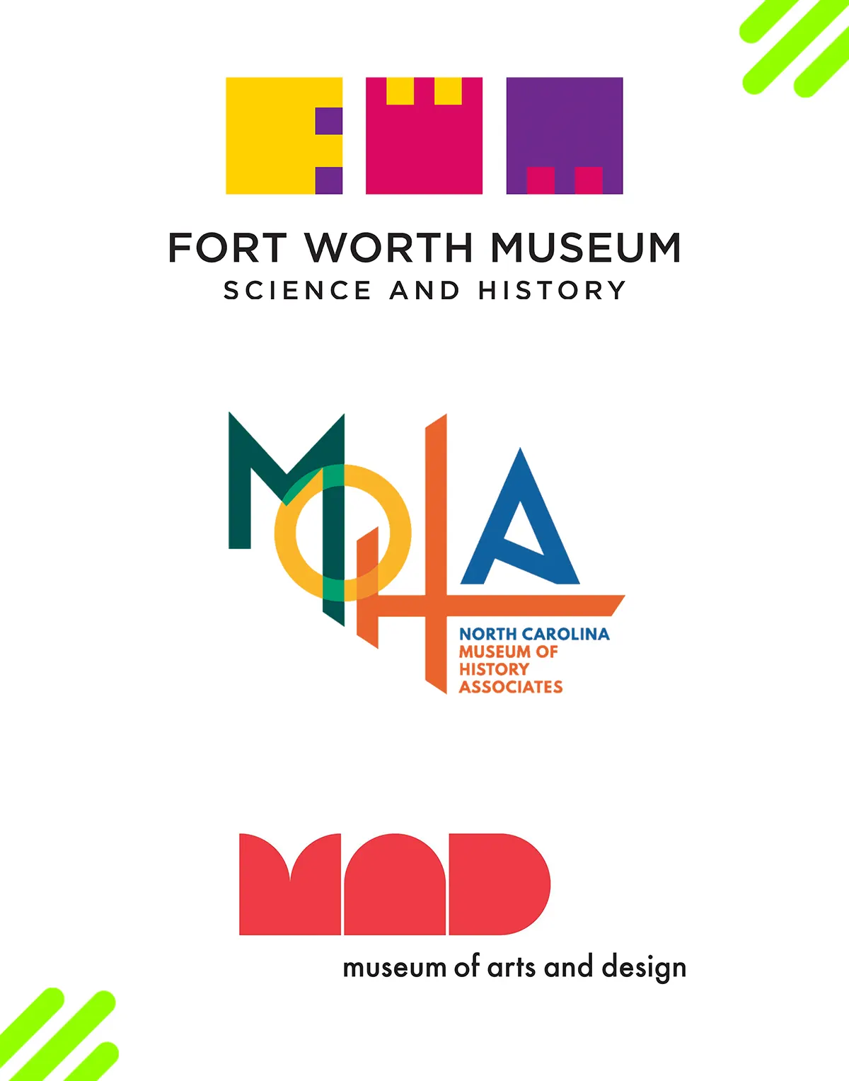
Creative Initials
Rather than dry initials, companies can make their abbreviated logo more visual by styling letters uniquely.
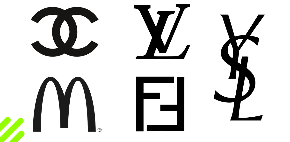
Some creative initial techniques:
- Made out of industry-relevant shapes or objects
- Combined together into a monogram
- Converted into a pictorial illustration
- Crafted to resemble the company name
- Illustrated with textures related to products/services
- Given dimensionality with shadows and angles
For example, entertainment company initials styled as 3D blocks or carved wood letters make a stronger impression.
Embed Shapes Within Letters
Another way to visualize initials is embedding symbolic shapes, illustrations and textures within the negative space of letters:
- Nature scenes shapes within letters for a wildlife tourism company
- Network icons integrated within tech initials
- Food illustrations inside hospitality letters
- Stars and music notes within entertainment initials
This adds discoverable depth to abbreviated logos when you look closely. Shapes add meaning while retaining simplicity.
Fragment Words Across Letters
Rather than fully abbreviating a name, partitioning words creatively across letterforms can add visual interest.
For example:
Federal Express [FedEx]
Pan American Airways [PanAm]
American Express [AmEx]
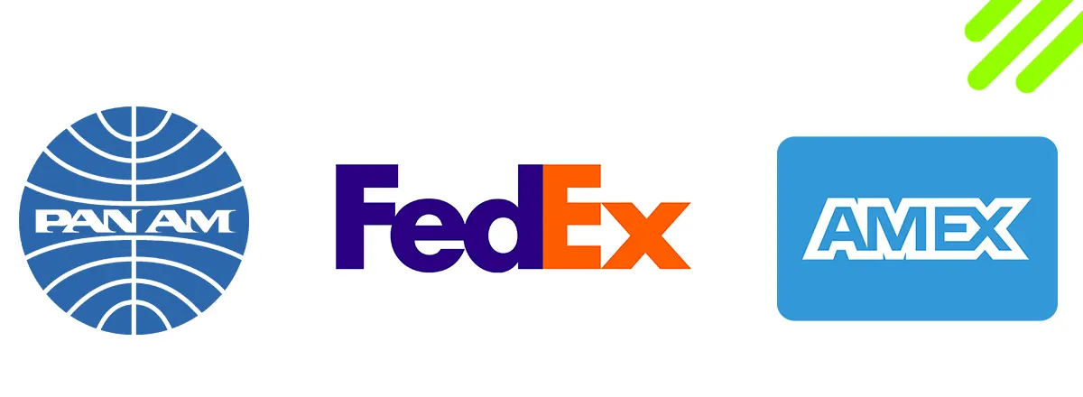
Segmenting words into syllables with each appearing in different letters creates intriguing word puzzles. It keeps names readable but more compact overall.
Utilize a Descriptive Tagline
Rather than cramming a lengthy name into the logo, incorporate a shorter descriptive tagline capturing your brand essence.
The pithy tagline becomes the memorable component while the full name offers clarity on the company itself.
Layered Logos
A layered logo stacks multiple components while retaining legibility:
Icon on top of stylized initials
Shortname overlapping a descriptive tagline
Condensed long name integrated with a symbol
Full name underneath stylized abbreviated logo
Carefully balancing layered elements creates a multi-dimensional logo able to handle complexity. But ensure individual aspects remain identifiable.
Repetition and Patterns
Turning lengthy names into repeating patterns or mosaics makes them more visually engaging. For example:
Name styled like intricately tiled mosaic
Repeating name in graduating sizes
Letters forming seamless background textures
Mirrored kaleidoscopic effects
Patterns add energy while allowing long names to be displayed prominently. But strategic whitespace is still important to avoid visual overload.
Kinetic Logo Animation
Logos no longer have to remain static. Animation offers opportunities to reveal lengthy names gradually:
Letters slide or flip in one after another
Name emerges from morphing background shape
Words join together like magnetic puzzle pieces
Letters fade in like developing photographs
Text becomes visible through slit scan motion
![]()
Unveiling animated logos hold attention and build mystery before the full name is displayed. But ensure final static logo works stndalone.
Monogram Arrangements
Rather than a standard stacked or overlayed monogram, creative arrangements make initials more engaging:
Overlapping in a circle like a Venn diagram
Rotating separately within a containing shape
Arranged vertically like building blocks
Merging together into ambiguous forms
![]()
Innovative monogram layouts add energy, though legibility requires care. Allow individual letters to shine.
Meaningful Color Coding
Color coding lengthy logos improves comprehension speed:
- Distinct colors for each word
- Gradient hues flowing downward through name
- Color blocking different name segments
Subtle color coding creates visual delineation. Our brains can absorb color-grouped information faster than plain black type.
Interpretive Pictograms
Convert lengthy names into a series of abstract pictograms open to interpretation:
- Each word or syllable represented by a simple icon
- Visual puns and symbols reference the name creatively
- Meaning evolves through combinations of icons
- Viewers puzzle out connections between images
Pictographic logos allow lengthy terms to be depicted visually. Images stick better in our minds than plain text.
Decorative Borders and Backgrounds
Framing lengthy logos within artistic borders and backgrounds makes the full name feel visually unified:
- Ornate vintage frames
- Geometric shapes enclosing logo
- Wreaths, ribbons and foliage styles
- Complex background patterns
![]()
Artful surroundings bring prominence, rather than obscuring lengthy names. White space remains vital though.
Own the Length
Finally, brands shouldn’t shy away from proudly displaying lengthy names if core to their identity. Some tips:
- Increase tracking for legibility
![]()
- Use ultra-thin condensed fonts
![]()
- Stylize through color, handwriting or textures

- Split across two stacked lines

- Incorporate as a repeated pattern
- Display name prominently as part of background scene
![]()
Owning verbosity confidently demonstrates authenticity. But aim for elegant communication rather than dense walls of text.
Conclusion
Lengthy brand names can pose design challenges. But they aren’t insurmountable obstacles. Through careful typographic refinement, abbreviation, symbolic monograms, and other solutions, long names transform into memorable logos.
Prioritize clarity and adaptability during the reduction process. Don’t overly sacrifice legibility simply for brevity’s sake. Find the right balance and give verbose names graphical impact.
Rather than limitations, view long names as opportunities for creativity. They allow more room for illustrative interpretations, layered depth, and nuanced messaging.
Resist bland fonts and generic compositions. Bring innovation to typographic treatments, pictorial symbols, animated sequencing and color experimentation. Make long names graphic centerpieces rather than barriers.
With conceptual spirit and technical skill, companies with verbose identities craft logos that ingrain their lengthy names within the consumer conscience. Distill verbosity into visual poetry.
- Previous ArticleThe Evolution and Impact of Pepsi Logo Design Over the Years
- Next ArticleSweet Logo Design Style