Pepsi Logo History. How has Pepsi logo changed over the years
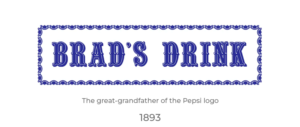
In the late 19th century, in the heart of America's bustling industry, a new drink was created in the vibrant streets of New Bern, North Carolina. This drink, with its caramel hues and effervescent bubbles, became an icon of refreshment and a symbol of cherished moments.This marked the beginning of a beverage that would go down in history, famously known as Pepsi. The old Pepsi logos—those timeless symbols that have danced through generations, capturing the spirit of an ever-evolving society—are far more than mere marks of commerce. They are chapters in a visual saga, telling a tale of innovation, identity, and the indomitable spirit of a brand that has stood the test of time. Reflect for a moment on the significance of a logo. It is not simply an image or a collection of letters.
A logo is the heartbeat of a brand, pulsing with the lifeblood of its ethos, its identity, and the very essence of its soul. In the symphony of the market's cacophony, a logo is the melody that resonates with us, that we hum subconsciously as we navigate the aisles of our choices. With each sip of Pepsi, we've not just quenched our thirst, we've imbibed a piece of Pepsi history. The old Pepsi logos remind us of our first stolen kiss at a high school dance, of the cheers at a baseball game, of the solace found in the fizz and pop during times both jubilant and trying. They evoke the taste of youth and the rush of memories, each logo a bookmark in the diary of our lives. Why does this matter? Because as we venture into the narrative of Pepsi and its storied emblem, we delve into a cultural lexicon that extends beyond the boundaries of a simple drink.
We explore the alchemy of design and desire, of color and culture, and how a singular brand has managed to encapsulate the ethos of not just a nation, but of a global family. Through the old Pepsi logos, we will witness the evolution of a symbol that has mirrored the American dream. The dream is both constant and ever-changing, as vibrant and bold as the colors adorning the cans and bottles that line the shelves of our collective experience. Let's raise a glass to the old Pepsi logos that have witnessed the world turn and have remained with us as sentinels of a legacy that continues to bubble forth with hope, resilience, and the promise of refreshment in every drop. Here's to the journey of the Pepsi logo - an emblem not just of a drink, but of times lived and cherished.
The Early Years (1893-1940)
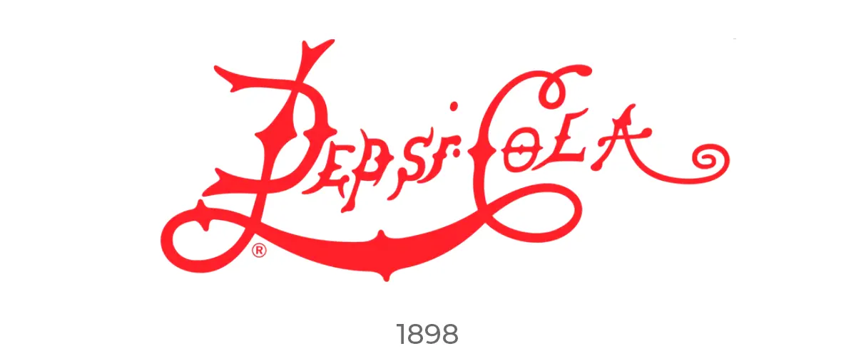
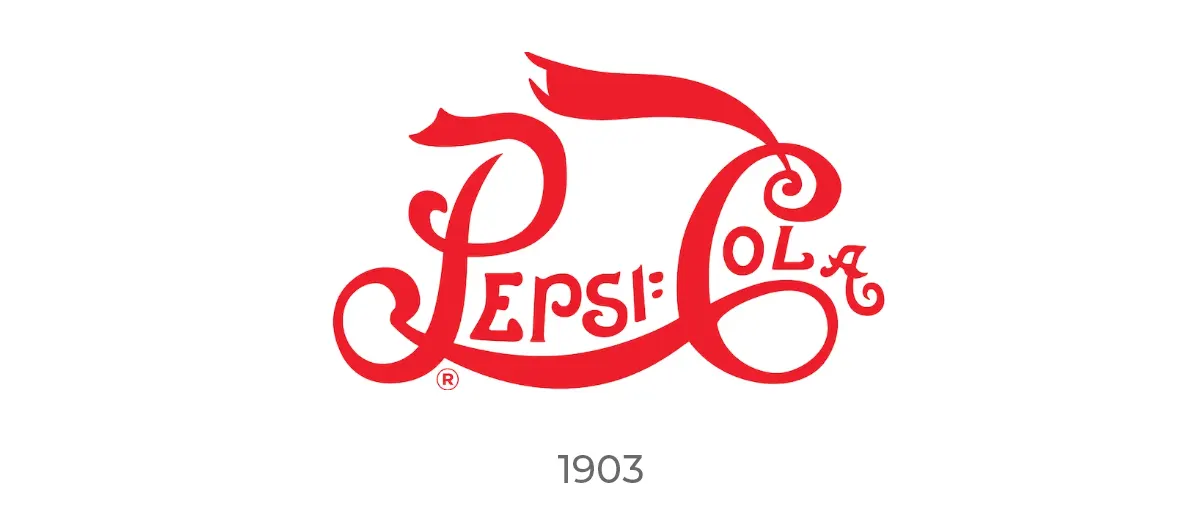
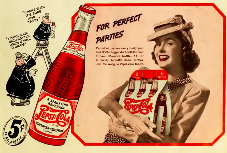
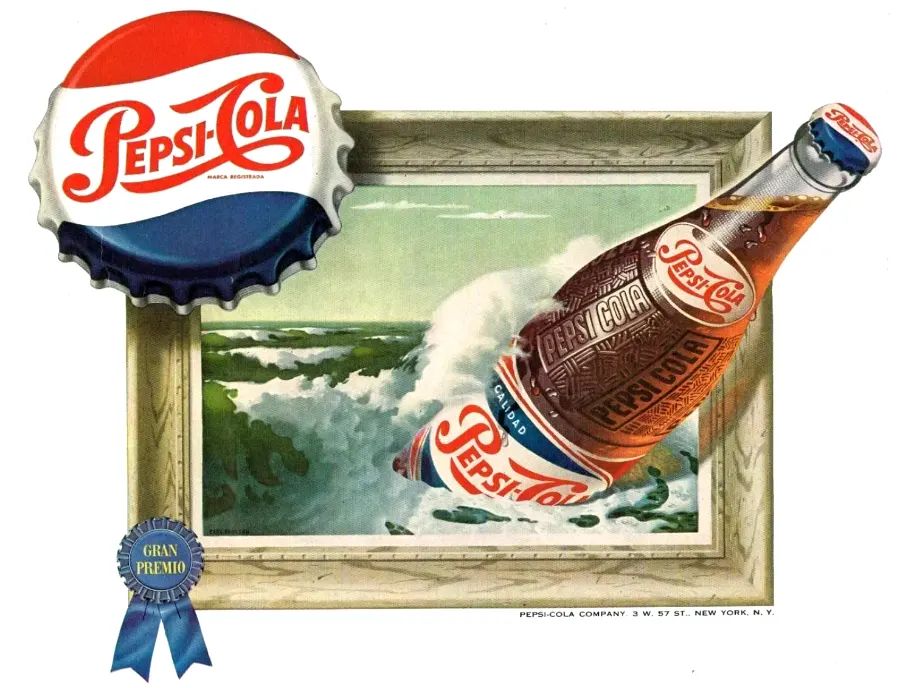
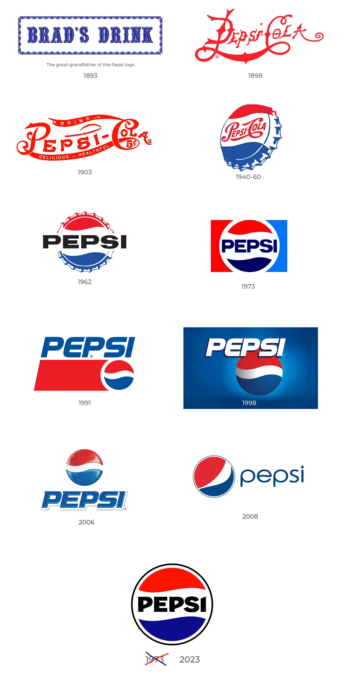
Imagine the scene: the soda fountain, the clink of ice against glass, the laughter and camaraderie of a community coming together, all under the watchful eye of the burgeoning brand's emblem. As the years ticked by, the logo took on the patriotic hues of red, white, and blue, a nod to the nation's flag, and in 1940, it settled into a form that many still hold dear. It wasn’t just a logo; it was a stamp of American life, a beacon of refreshment in a world on the brink of change.
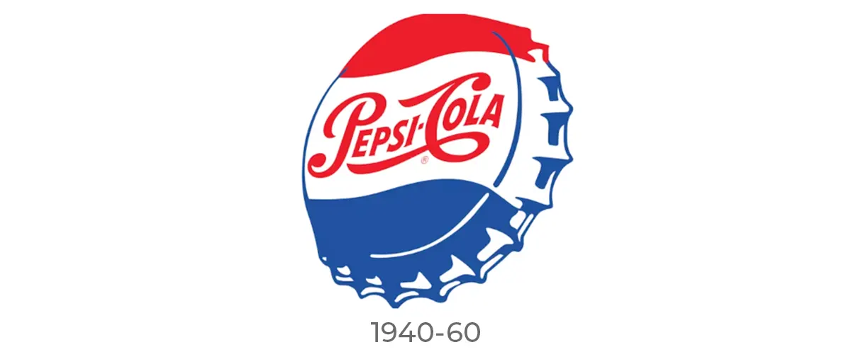
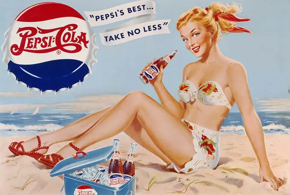
The Mid-Century Shift (1950-1980)
As the 1950s dawned, the world was changing at a dizzying pace. Design took flight with the jet age, and Pepsi's logo soared along. This era saw the old Pepsi logos evolve with more than just a nod to aesthetics; they became sleeker, more dynamic.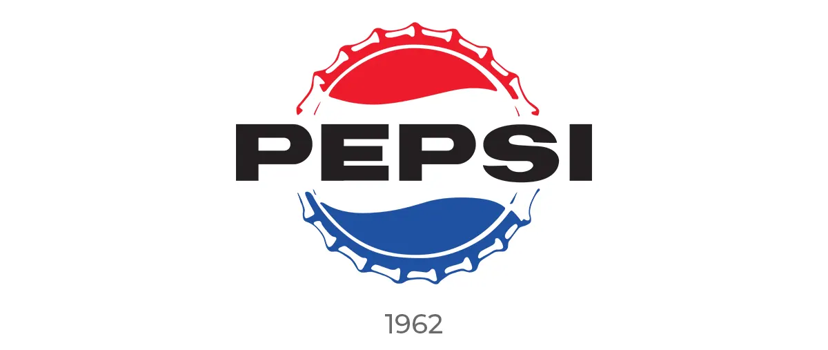
The introduction of the iconic globe, nestled next to the script, symbolized an embrace of a new, interconnected world. This globe wasn't just a design element; it was a crystal ball reflecting a future full of possibilities, a world growing smaller, a brand becoming larger. It stood as a testament to Pepsi's global reach, its universal appeal.
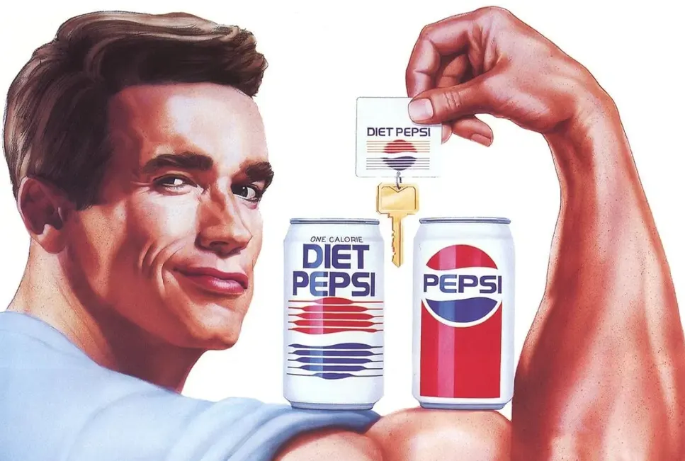

The swirling red, white, and blue design beckoned to consumers, inviting them to be part of the Pepsi generation, to live for the moment, to "Think young."
The Modern Era (1981-Present)
As we strode into the 1980s and beyond, the old Pepsi logos matured, yet remained ever youthful.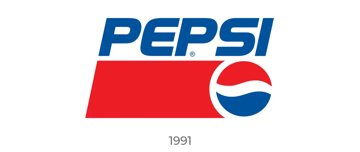
In 1991, a bold decision was made: the wordmark and the globe were separated, giving each element its own space to shine. The globe, known affectionately as the 'Pepsi Globe', was no longer confined by letters, free to become a standalone icon of pop culture.
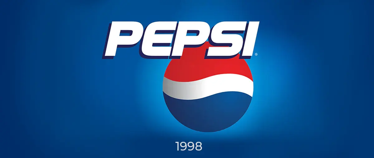

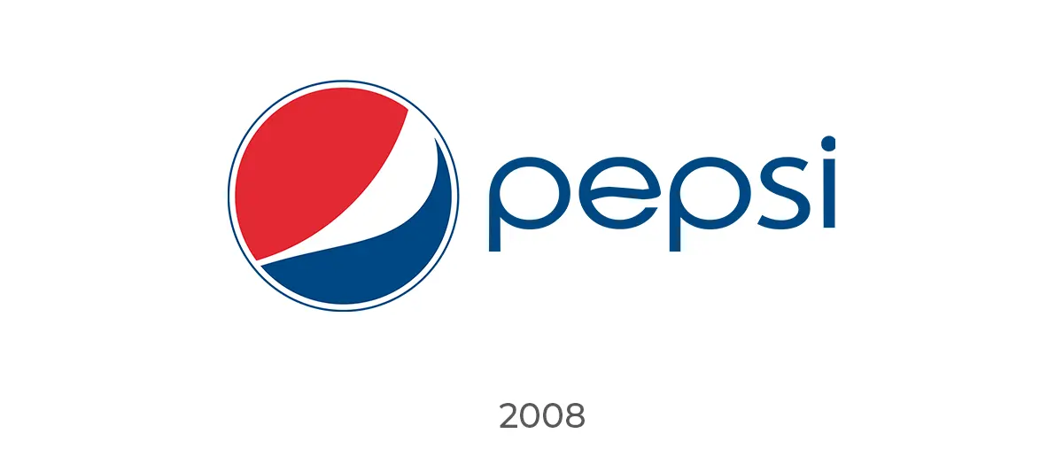
The millennium brought with it a new design frontier, and Pepsi's logo ventured into the third dimension. The blue of the globe deepened, like the twilight sky, heralding the brand's confidence and depth. Then, in 2008, a revolution: the logo was distilled to its essence, a simple circle, dynamic and fluid, a symbol of movement and potential.
Back to the past
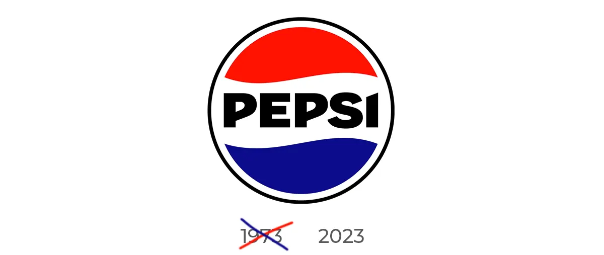
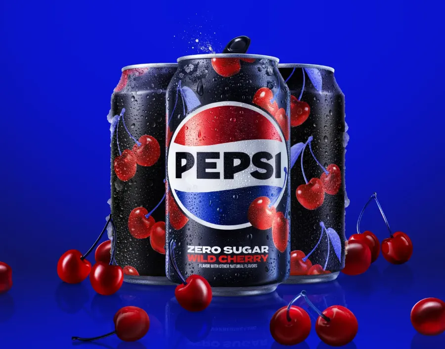
In 2023, Pepsi updated its globe logo, and like many companies returned to its roots, but this time it drew inspiration from the well-forgotten 70s, gently playing on the feeling of nostalgia.
Impact and Recognition
Through the decades, the old Pepsi logos have witnessed the world in flux but have remained a constant in our lives. These variations of circles, swirls, and text have been more than just a brand identifier; they've been a canvas capturing our collective dreams, a familiar friend in moments of joy and solace.Cultural and Marketing Significance
Each iteration of the old Pepsi logos has been a response to the heartbeat of culture, pulsing with the times. They've been the silent witness to our history, evolving with our music, our fashion, and our values. When Pepsi dared to tweak its logo, it wasn't just a business decision; it was a cultural statement, an invitation to the public to see the world through a refreshed lens.Future Speculations
Gazing into the horizon, one wonders how the old Pepsi logos will evolve. Will they take on new shapes, embrace virtual realities, or return to their vintage roots? They stand at the crossroads of heritage and innovation, ready to leap into the unknown, to reflect the new dreams of the next century.As our journey through the tapestry of old Pepsi logos draws to a close, we stand at the precipice of reflection and awe. Like the final notes of a symphony lingering in the concert hall, the essence of Pepsi’s visual anthem resonates within us. We’ve traversed more than a century, a voyage through time carried on the wings of a logo that has become much more than a brand identifier—it has become a cultural icon, a beacon of innovation, and a companion to the collective moments that define us.
With every redesign, every bold stroke of creativity, the old Pepsi logos have whispered tales of eras bygone and hinted at the promise of tomorrow. They have been the silent observers of history, the constants in the chaos, evolving yet enduring. They have not just survived the shifting sands of time; they have thrived, reflecting our changing tastes, our aspirations, and our undying quest for that which is refreshingly familiar. The Pepsi logo is a symbol of the brand's indomitable spirit. As Pepsi changes its logo, it continues to boldly etch its place in our hearts. It reflects both our past and our future, and punctuates the sentences of our lives. Just as Pepsi changes logo, the logo itself always retains that expressible quality that makes us stop and say, “Yes, that's Pepsi”. The old Pepsi logos have not merely been emblems of a beverage; they have served as bookmarks in the narrative of our lives, from the sunlit picnics of our youth to the shared moments of joy across generations.
They remind us that within each sip lies the fizz of innovation, the sparkle of anticipation, and the sweet taste of memories waiting to be made. In the end, what remains is more than the sum of colors, shapes, and fonts—it’s the embodiment of a legacy that spans over 120 years. The Pepsi logo, in its many forms, stands resilient and adaptive, much like the human spirit it has endeavored to encapsulate. Here’s to the old Pepsi logos, may they continue to evolve, inspire, and refresh our souls as we look forward to the next chapter in this effervescent saga.
As we conclude, we see that our story is not ending. It is simply pausing to take a breath as the brand continues its journey forward. The future chapters of the Pepsi logo are waiting to be written in the hearts of new generations, ready to be unveiled like a fresh canvas to a waiting world. So, we look ahead with anticipation, ready to embrace the new versions with the same enthusiasm as those that have come before. Let's raise a toast again to the lasting legacy of Pepsi. The brand has captured the essence of time in a bottle and its logo is as timeless as the effervescent spirit it represents. Cheers to the past, present, and future of a logo that is, and always will be, uniquely Pepsi.
- Previous ArticleLogo Logic
- Next ArticleDesigning Logos for Companies With Long Names