Logos are an essential part of branding and have become a well-known symbol of a company or product. They serve as a visual representation and provide instant recognition to a brand. Some logos are so famous and iconic that they are instantly recognizable.
Designing a logo requires careful consideration and creativity. It is not an easy task to create an emblem that is both memorable and impactful. However, some brands have managed to create logos that have stood the test of time and have become iconic in their own right.
In this article, we will take a closer look at the top 10 famous logos that you need to know. These logos have become synonymous with their respective brands and are instantly recognizable to people all over the world. From the golden arches of McDonald's to the iconic swoosh of Nike, these logos have made a lasting impression on popular culture.
Whether you are interested in branding or simply appreciate good design, these logos are sure to inspire you. So, let's dive in and explore the world of branding and the underlying power of a recognizable logo.
![]()
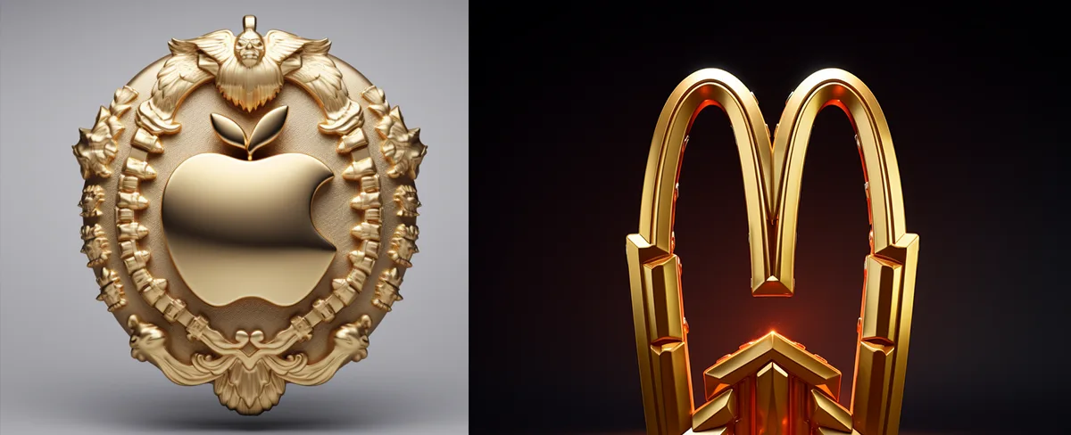
1. Apple Inc.: The Logo That Became an Icon
The symbol of Apple Inc. has become one of the most recognizable and iconic in the world of branding. The famous Apple logo design has evolved over time, but its core elements have remained consistent and memorable.
The Birth of an Iconic Emblem
The original Apple logo, designed in 1977, featured a drawing of Sir Isaac Newton under a tree, with an apple about to fall on his head. This emblem reflected the company's belief in innovation and inspiration, drawing a connection between Newton's discovery of gravity and the revolutionary nature of their products.
![]()
However, this complex and detailed logo was soon replaced with a simpler and more modern design.
The Birth of Simplicity
In 1977, the well-known "rainbow" logo was introduced, depicting an apple with a bite taken out of it. The rainbow colors symbolized the creativity and diversity of Apple's products and consumers.
Over the years, the logo has undergone slight modifications, but the basic shape and concept have remained the same. The bitten apple has become synonymous with Apple Inc., representing innovation, simplicity, and user-friendly design.
![]()
Today, the Apple logo is instantly recognizable, even without the company name accompanying it. Its iconic design has made it an emblem of innovation and quality, capturing the imagination of people around the world.
The Apple logo stands as a testament to the power of effective branding and design. It has become a symbol of technological excellence and has cemented Apple's place as one of the most well-known companies in the world.
Next time you see that familiar emblem on a device or advertisement, take a moment to appreciate the influence and impact that the Apple logo has had on the world of design and branding.
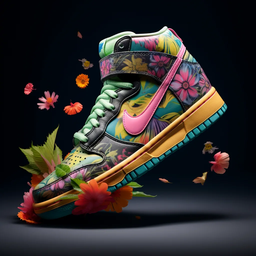
2. Nike: The Swoosh That Represents Victory
Nike, an iconic and well-known brand, has a logo that is recognizable around the world. The Nike logo, often referred to as "the swoosh", is one of the most famous logos in the history of design.
The Nike swoosh is a simple yet powerful emblem that symbolizes victory. The logo was created in 1971 by Carolyn Davidson, a graphic design student at Portland State University. Davidson's design, inspired by the wings of the Greek goddess of victory, became the symbol that represents the brand.
![]()
Over the years, the Nike swoosh has become synonymous with athleticism, excellence, and success. It has become an integral part of Nike's branding and marketing strategies. The logo can be seen on Nike products, from shoes to apparel, and is instantly associated with the brand.
With its simple and bold design, the Nike swoosh stands out and leaves a lasting impression. It has become an iconic symbol that represents not only the brand, but also the spirit of victory and achievement.
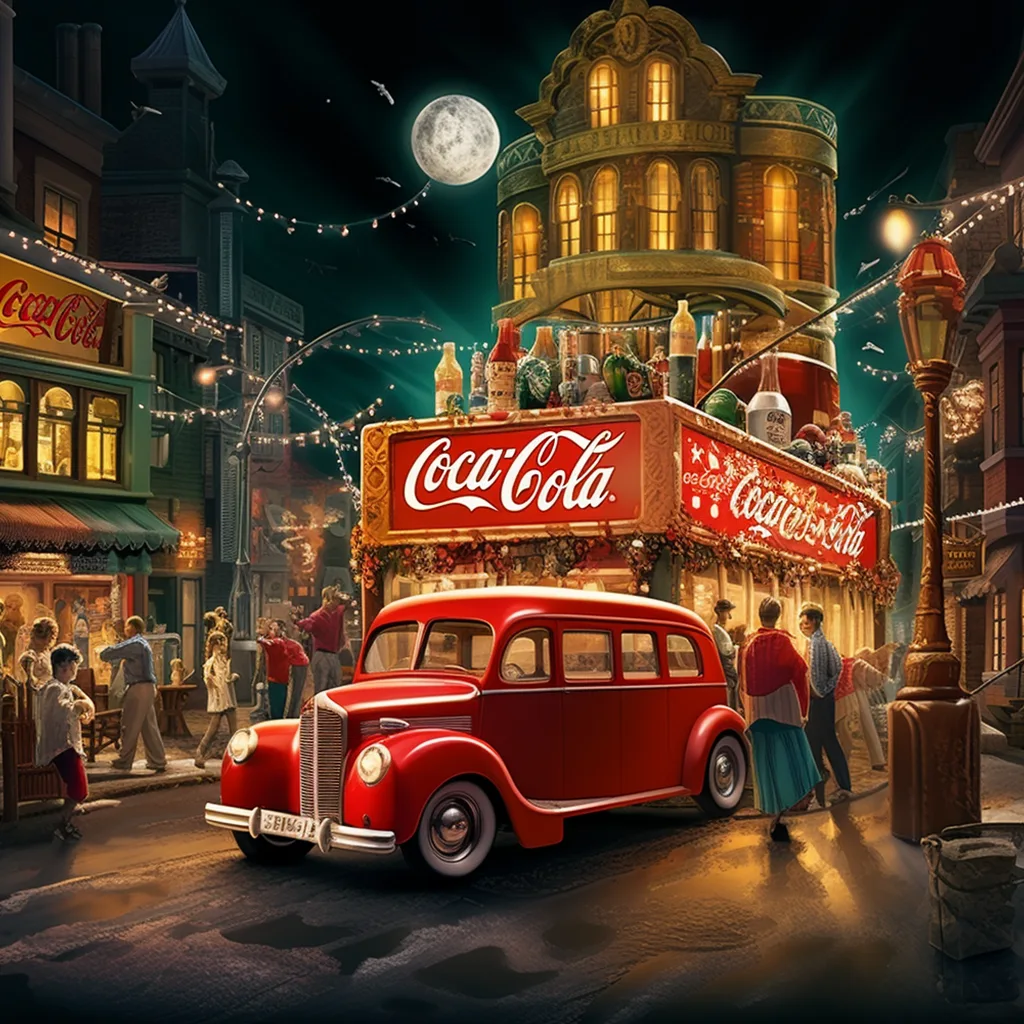
3. Coca-Cola: The Logo That Refreshes
When it comes to iconic logos, Coca-Cola's symbol is one that is instantly recognizable around the world. The trademark emblem of Coca-Cola has become synonymous with the brand's mission of providing a refreshing beverage to consumers.
![]()
The design of the Coca-Cola logo is simple yet impactful. The company's distinctive script typography, known as Spencerian script, gives the logo a timeless and classic look. The script is complemented by a red background, which further enhances its visual appeal.
![]()
One of the reasons why the Coca-Cola logo is so well-known is because of the brand's successful branding efforts. Throughout the years, Coca-Cola has consistently used their logo in advertisements and marketing campaigns, making it a familiar sight for consumers.
The Coca-Cola logo has also become an iconic symbol of American culture. It is often associated with happiness, joy, and togetherness, as seen in the brand's famous holiday advertisements. The logo's popularity has transcended borders and has become a global symbol of refreshment and enjoyment.
![]()
Overall, the Coca-Cola logo is a testament to the power of effective branding and design. It is not just a logo, but a symbol of a well-established and beloved brand. Whether it's featured on a soda can or a billboard, the Coca-Cola logo is a constant reminder of the refreshing experience that the brand offers.
4. McDonald's: The Golden Arches of Fast Food
The golden arches of McDonald's are a prime example of successful branding. The logo is simple yet effective, capturing the essence of the brand. The golden arches symbolize the fast and convenient service that McDonald's provides. They are a visual representation of the brand's commitment to serving customers quickly and efficiently.
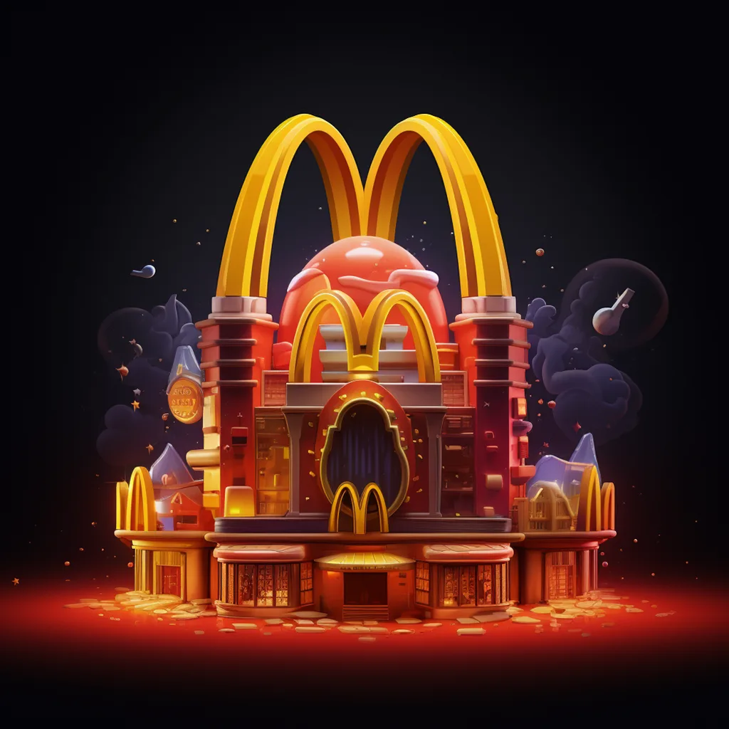
McDonald's logo is famous worldwide and can be seen in almost every major city around the globe. The symbol of the golden arches has become synonymous with fast food and is ingrained in the minds of people worldwide. It is a logo that is easily identifiable and has stood the test of time.
The Evolution of the McDonald's Logo
Over the years, the McDonald's logo has gone through a few changes, but the golden arches have remained a constant. Originally, the arches were a part of the restaurant's architecture, forming a physical entrance to the building. As the brand grew, the golden arches became a standalone symbol and were incorporated into the logo.
The History of the Golden Arches
The idea for the golden arches came about in the 1950s when McDonald's was starting to expand its franchise. Ray Kroc, the man responsible for the franchise's success, saw the arches on the original restaurant in San Bernardino, California, and recognized their potential as a symbol for the brand.
Kroc's vision was to create a logo that would be easily recognizable and depict the fast and efficient service that McDonald's was known for. The golden arches were a perfect fit, as they created a sense of excitement and urgency. The logo was introduced in 1961 and has remained unchanged ever since.
![]()
In the early days, the McDonald's logo featured a stylized version of the company name along with the golden arches. The logo evolved over time, becoming more streamlined and modern. Today, the logo consists of the golden arches placed above the McDonald's name in bold, red letters.
A Recognizable Emblem of Fast Food
The McDonald's logo has become more than just a brand symbol; it has become a cultural icon. The golden arches evoke a sense of familiarity and comfort. They are a symbol that resonates with people of all ages and backgrounds.
![]()
Whether you love it or hate it, there is no denying the influence and impact of McDonald's on the fast food industry. Its logo is a testament to the power of branding and the importance of creating a recognizable emblem. The golden arches have cemented McDonald's place in popular culture and will continue to be a symbol of fast food for generations to come.
5. Google: The Multicolored G That Changed the World
Google, with its iconic multicolored emblem, is one of the most recognizable logos in the world. Its sleek and simple design has become synonymous with the brand itself, and is instantly identifiable by people of all ages and backgrounds.
![]()
The well-known Google logo is a symbol of the company's commitment to innovation and user-friendly design. The multicolored G represents the diversity and global reach of the search engine giant. It has become an integral part of Google's branding and is used across all its products and services.
Over the years, Google's logo has undergone subtle changes, but the core elements have remained the same. This consistency has contributed to its success and has made it a famous symbol worldwide.
More than just an emblem, the Google logo is an embodiment of the company's mission to organize the world's information and make it universally accessible and useful. It is a symbol of technological advancement and has revolutionized the way we search and interact with information online.
![]()
From a small search engine startup to one of the biggest tech companies in the world, Google's logo has played a significant role in shaping its identity and brand. It has become an integral part of our daily lives, symbolizing reliability, innovation, and the power of knowledge.
Google's multicolored Letters is not just a logo; it is a representation of the company's commitment to pushing boundaries and changing the world. It has become an iconic symbol that has become ingrained in our culture and society, forever changing the way we search for and consume information.
6. Adidas: The Three Stripes That Define Sportswear
When it comes to recognizable logos in the world of sportswear, the Adidas logo stands out as one of the most famous and iconic designs. The well-known logo consists of three parallel stripes, which have become synonymous with the Adidas brand.
![]()
The Adidas logo is not just a design, but a symbol that represents the brand's dedication to quality and performance. The three stripes are instantly recognizable and have become a part of the brand's branding strategy, appearing on everything from sneakers to clothing to accessories.
What makes the Adidas logo so well-known and iconic is its simplicity. The three stripes are clean and bold, making them instantly identifiable. This simplicity allows the logo to be easily adaptable and versatile, allowing it to be used in various designs and contexts.

Throughout the years, the Adidas logo has become a symbol of excellence in sportswear. The brand has built a reputation for producing high-quality products that are both stylish and functional. The logo serves as a reminder of the brand's commitment to delivering top-notch performance gear for athletes and sports enthusiasts alike.
Overall, the Adidas logo is a prime example of effective branding. Its simplicity and iconic design have made it one of the most recognizable logos in the world of sportswear. The three stripes have become synonymous with the Adidas brand and serve as a testament to the brand's success and legacy in the industry.
7. Facebook: The Blue F That Connects Billions
Facebook is an iconic social media platform that has revolutionized the way people connect with each other. Its well-known logo, an emblem in the world of technology and social networking, has become synonymous with the brand itself.
![]()
The famous blue "F" symbolizes Facebook's branding and represents the platform's mission to connect billions of people around the globe. The logo is instantly recognizable and has become a symbol of communication and social interaction.
With its simple yet impactful design, the Facebook logo has become one of the most recognizable logos in the world. It is often seen on mobile devices, desktops, advertisements, and even in everyday conversations.
Symbol of Connectivity
The Facebook logo is more than just a symbol – it represents the power of connection. With just a click of a button, users can connect with friends, family members, and even strangers across different continents. The logo serves as a constant reminder of the platform's mission to bring people closer together.
Significant Impact on Society
The Facebook logo has had a significant impact on modern society. It has become deeply ingrained in our daily lives, affecting the way we communicate, share information, and stay connected with others. The logo has become a part of popular culture and has shaped the way we interact in the digital age.
In conclusion, the Facebook logo is an iconic and well-known symbol that represents the power of connection and social interaction. Its simple design and widespread recognition have made it a famous emblem in the world of branding and technology.
8. Amazon: The Arrow That Smiles
The logo of Amazon is one of the most recognizable and iconic logos in the world. It features a simple yet powerful symbol that represents the brand's identity. The design is well-known and instantly associated with the e-commerce giant.
![]()
The Amazon logo consists of a smiling arrow that points from the letter "A" to the letter "Z." This symbolizes the wide range of products available on the platform – from A to Z. The arrow also forms a subtle smile, representing the brand's commitment to delivering a positive and satisfying customer experience.
![]()
Amazon's branding strategy has played a significant role in making the logo famous. The combination of the distinctive arrow and the company's name creates a strong visual impact that is easily recognizable across different platforms and media.
The simplicity and versatility of the logo also contribute to its popularity. The clean and minimalist design allows for easy reproduction and adaptability, ensuring that the logo remains consistent across various applications, such as website, app, packaging, and advertising materials.
Overall, the Amazon logo stands out as a prime example of effective branding through a simple yet memorable design. The arrow that smiles has become an enduring symbol of the company's success and commitment to customer satisfaction.
9. Microsoft: The Four-Colored Windows for Tech
Microsoft is a globally recognized technology industry giant, and its logo is one of the most iconic and famous designs in the world. The company's logo consists of a four-colored window design, which has become synonymous with the brand and its products.
![]()
The Microsoft logo was initially introduced in 1975 and has undergone several updates and modifications since then. The logo features a series of four colored rectangles arranged in a grid-like pattern, with each rectangle representing a different color - blue, red, yellow, and green.
The four colors in the Microsoft logo have various meanings and symbolisms. Blue represents trust, reliability, and loyalty, which are key qualities that Microsoft strives to deliver in its products and services. Red symbolizes energy, power, and excitement, showcasing Microsoft's innovation and cutting-edge technology. Yellow represents optimism, creativity, and happiness, reflecting the positive impact that Microsoft aims to have on people's lives. Lastly, green signifies growth, harmony, and balance, highlighting Microsoft's commitment to sustainability and environmental responsibility.
![]()
The distinctive design of the Microsoft logo has become instantly recognizable, making it an essential part of the company's branding efforts. It has become an emblem of Microsoft's technological prowess and global influence, serving as a visual representation of the company's commitment to delivering innovative and user-friendly products.
By maintaining consistency in its logo design over the years, Microsoft has established a strong and enduring brand identity. The four-colored windows have become synonymous with the company, instantly bringing to mind its technological innovations and contributions to the industry.
10. Starbucks: The Siren That Brews a Community
Starbucks, the well-known coffeehouse chain, has one of the most recognizable logos in the world. The Starbucks logo features a stylized twin-tailed mermaid, known as the Siren. The design of the logo is based on a 16th-century Norse woodcut of a twin-tailed mermaid, which symbolizes seduction and allure.
![]()
The emblem has become iconic and is instantly associated with the Starbucks brand. The green and white colors used in the logo also contribute to its recognition. The logo has undergone a few modifications over the years, but its essence has remained intact, making it a famous symbol worldwide.
Starbucks logo plays a crucial role in its branding. Beyond being a simple representation of the brand, it serves as a visual representation of the community that Starbucks aims to create. The logo evokes a sense of warmth, comfort, and welcoming ambiance that draws people in.
The Starbucks brand has successfully positioned itself as more than just a coffeehouse. It has become a gathering place for friends, a space for remote work, and a hub for people to connect and socialize. The logo acts as a beacon, attracting individuals to come together and form a community around the shared experience of enjoying a cup of coffee.
With its recognizable logo, Starbucks has established itself as a global household name. The logo's design, the iconic Siren, and the community-driven branding continue to solidify Starbucks' position as a leader in the coffee industry.
11. Instagram: The Vintage Camera That Captures Moments
Instagram, a social media platform that has taken the world by storm, is well-known for its famous vintage camera logo. The design of this iconic logo has become synonymous with capturing and sharing memorable moments.
The Iconic Camera Symbol
The Instagram logo features a vintage camera that harkens back to the days of film photography. The camera symbolizes the essence of Instagram, which is all about capturing and sharing moments in a nostalgic and artistic way. The simplicity and recognizability of the camera logo have contributed to its popularity.
![]()
Branding through the Logo
The Instagram logo has become an integral part of the brand's identity. It helps create a strong association between the platform and its vintage-inspired aesthetic. The logo is instantly recognizable and evokes feelings of creativity, nostalgia, and sharing. It has become a symbol of the Instagram community and the ability to capture and share moments with a global audience.
The Instagram logo has also played a significant role in the platform's success. Its design is visually appealing and has helped attract users from all walks of life. The logo's simplicity and charm have made it one of the most iconic and recognizable logos in the world of social media.
In conclusion, Instagram's vintage camera logo is a famous and well-known symbol that has become synonymous with capturing and sharing moments. Its design and recognizability have contributed to the platform's branding and success, making it an iconic logo in the world of social media.
12. Twitter: The Blue Bird That Chirps in 280 Characters
Twitter is one of the most emblematic social media platforms of our time. With its famous blue bird logo, it has become a symbol of communication and connectivity. The branding is recognizable worldwide, making it an iconic representation of the platform's purpose.
The design of the Twitter logo is simple yet effective. The blue bird, facing right, is outlined in white, giving it a clean and crisp look. The bird is in flight, symbolizing the freedom and speed of communication that Twitter offers. It is a modern and minimalist icon that has stood the test of time.
Twitter's logo has undergone a few changes throughout the years, with minor tweaks to the bird's silhouette and posture. However, the overall essence of the logo has remained intact, maintaining its iconic status.
Aside from its visual appeal, the Twitter logo represents the essence of the platform itself. The bird chirps, conveying short but meaningful messages in just 280 characters. It serves as a reminder that brevity can be powerful and impactful.
Branding and Recognition
Twitter's branding is second to none. The company has successfully built its brand around its iconic logo and the platform's unique features. The blue bird has become synonymous with Twitter, and its use in various marketing materials and social media campaigns has further solidified its recognition.
Thanks to its recognizable logo, Twitter is easily distinguishable among other social media platforms. The bird's silhouette stands out, making it instantly identifiable, even at a glance.
Twitter's "bluebird" logo is the greatest sign on the internet, but it is now history, having been replaced by a soulless "X"
![]()
![]()
13. Mercedes-Benz: The Elegant Logo of Luxury
Since its inception in 1909, the Mercedes-Benz logo has undergone subtle changes but has remained a powerful representation of the brand's prestige and sophistication. It has become a well-known symbol of elegance and opulence in the automotive industry.
![]()
The Mercedes-Benz logo is not just a logo; it is a statement of class and status. It evokes a sense of high-end craftsmanship and perfection that sets the brand apart from its competitors.
Mercedes-Benz has successfully incorporated its logo into its overall branding strategies, creating a cohesive and recognizable image across all its products and marketing campaigns. The logo has played a significant role in establishing and maintaining the brand's reputation for producing luxury vehicles of exceptional quality.
![]()
Over the years, the Mercedes-Benz logo has become synonymous with excellence and has earned its place among the most famous logos in the world. It embodies the brand's values and ambitions, serving as a constant reminder of the company's dedication to innovation and engineering excellence.
![]()
As a symbol of luxury and refinement, the Mercedes-Benz logo continues to capture the imagination of car enthusiasts worldwide. Its timeless design and association with the world of high-end automobiles make it an enduring and iconic symbol in the automotive industry.
14. BMW: The Blue and White Emblem of Precision
The BMW logo is one of the most iconic and recognizable symbols in the automotive industry. The blue and white design is instantly associated with the German luxury car brand, symbolizing its commitment to precision and excellence.
First introduced in 1917, the BMW logo has undergone several modifications over the years but has always maintained its distinctive blue and white colors. The logo represents the company's strong German heritage and its dedication to engineering and craftsmanship.
![]()
BMW's logo is a perfect example of effective branding. It is simple yet elegant, making it instantly memorable. The circular shape represents the company's focus on continuous innovation and limitless possibilities.
![]()
The blue and white colors of the logo have a deeper meaning as well. Blue symbolizes trust, reliability, and sophistication, while white represents purity and perfection. Together, these colors create a powerful visual identity that is synonymous with the BMW brand.
The Evolution of the BMW Logo
Over the years, the BMW logo has evolved while maintaining its core design elements. In the early years, the logo featured the letters "BMW" in a black circular frame, with blue and white checkered pattern in the center. In 1923, the checkered pattern was removed, and the blue and white colors were inverted, with the blue now in the center.
In 1933, the BMW logo underwent another change, with the letters "BMW" being enclosed in a circular ring with the Bavarian flag colors - blue and white. This design stayed in place for several decades until 2020 when the logo was simplified even further. The circular ring was removed, and the letters "BMW" were left alone, showcasing the brand's confidence and modernity.
The Famous BMW Logo
The famous BMW logo is instantly recognized worldwide. It can be seen on every BMW vehicle, representing the company's commitment to quality, performance, and luxury. Whether on the hood of a car or on a dealership sign, the BMW logo is a symbol of success and prestige.
With its iconic design and well-known branding, the BMW logo is a testament to the brand's excellence and attention to detail. It has become synonymous with luxury, precision, and innovation, making it one of the most famous logos in the world.
15. FedEx: The Bold Purple and Orange That Delivers
FedEx is a well-known and famous company that specializes in courier delivery services. One of the reasons why FedEx stands out is because of their bold and eye-catching logo design. The company's logo features the iconic combination of purple and orange, which has become synonymous with the brand.
The FedEx logo is a prime example of effective and memorable branding. The simple yet powerful symbol consists of an arrow embedded within the letters "E" and "x". This hidden arrow represents speed, precision, and the company's commitment to delivering packages on time.
![]()
The logo is instantly recognizable and has become a symbol of reliability and trust. The use of bold colors like purple and orange further enhances the logo's visibility and makes it stand out among competitors.
Furthermore, the FedEx logo is a perfect representation of the company's core values. The strong and confident design reflects the company's dedication to providing excellent customer service and exceeding expectations.
Overall, the FedEx logo is a testament to the power of effective branding. It showcases the importance of creating a recognizable and memorable symbol that encapsulates the essence of a company. The combination of bold colors, clever design, and hidden symbolism makes the FedEx logo an iconic and enduring emblem of the company's values and commitment to delivering excellence.
Question-Answer:
What are the top 10 popular logos everyone should know?
The top 10 popular logos everyone should know are Apple, Nike, McDonald's, Coca-Cola, Google, Facebook, Microsoft, Amazon, Starbucks, and Fedex.
What is the story behind the Apple logo?
The Apple logo was designed by Rob Janoff in 1977. The logo features an apple with a bite taken out of it, symbolizing knowledge and a nod to the biblical story of Adam and Eve. The rainbow colors were chosen to represent the Apple II's superior color graphics, and it has since become one of the most recognizable logos in the world.
How did the Nike logo come to be?
The Nike logo, also known as the "swoosh," was designed by Carolyn Davidson in 1971. She was a graphic design student at Portland State University at the time and was paid only $35 for her work. The logo represents motion and speed, and has become synonymous with the Nike brand and its "Just Do It" slogan.
What is the meaning behind the McDonald's logo?
The McDonald's logo, often referred to as the "Golden Arches," was designed in 1962 by Jim Schindler. The logo was created to resemble an "M" for McDonald's and also represents the architecture of their iconic restaurants. The yellow and red color scheme is meant to evoke feelings of joy and excitement, and the logo has become one of the most recognizable symbols of the fast food industry.
Why is the Coca-Cola logo so popular?
The Coca-Cola logo has remained largely unchanged since its creation in 1886. The logo features the distinctive Spencerian script font and the iconic red and white color scheme. The logo has become synonymous with the Coca-Cola brand and is recognized all over the world. It represents the history, tradition, and authenticity of the brand, making it one of the most popular logos of all time.
What are some of the most popular logos that everyone should know?
Some of the most popular logos that everyone should know include the logos of Apple, Nike, Coca-Cola, Google, McDonald's, Facebook, Amazon, Microsoft, Instagram, and Adidas.
Why is the Apple logo so popular?
The Apple logo is popular because it is simple, recognizable, and represents a popular brand that has revolutionized the technology industry. The bitten apple logo has become a symbol for innovation, design, and quality.
- Previous ArticleFunny sketches on a starbucks mug
- Next ArticleA Modern Twist on the Starbucks Logo: Blending Tradition with Innovation